
In a small exhibition space built entirely of nooks and crannies, Johanna Kieniewicz, the British Library’s science curator, has created a surprising display.
Take for example, the opening image of a zoomable “tree of life” by James Rosindell, a biodiversity theorist from Imperial College London. It looks innocuous enough: it might belong in a children’s picture book. But the wealth of visual and textual information sewn into every scale of the map proves staggering. Life is vast.
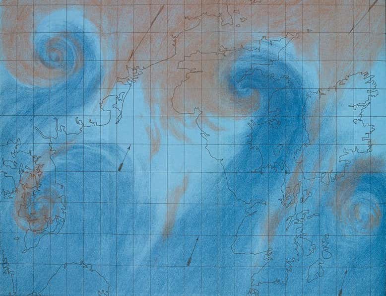
Along with the intellectual surprises, there are some historical ones. What looks like a satellite image of global atmospheric circulation turns out, on closer inspection, to date from 1863: a print from The Weather Book by Robert FitzRoy (sometime captain of the Beagle and a visionary climatologist).
But perhaps the best-judged exhibit is also the least showy: a well-constructed video of interviews dealing with all the tricky questions about data visualisation in one place. Just how scientific is it? Is it really beautiful? Or distracting? And what about the underlying assumptions?
Having addressed these very necessary questions so economically, Beautiful Science can, and does, deliver on its title.
Scientific visualisation began, we learn, in the 17th century with the weather records of sea captains. Neatly rendered on an in-house computer, these records foreshadow NASA’s deliriously blue Perpetual Ocean video of 2011. This unforced pairing of historical and recent exhibits turns out to be a real strength.
Some early visualisations are predicated on ideas that turned out to be wrong. For example, the moon has little effect on the weather, and cholera is not spread by “bad air”. The data used to explore these ideas, being perfectly valid, can still reveal different insights to later observers.
This is the real strength of visualisation: it suggests interesting correlations without getting snarled up in language, which by its very nature tends to slip causation into every argument, whether you mean it to or not.
Because good visualisations give the viewer the chance to interpret things quite freely, Beautiful Science turns out to be, in the best sense, a playful exhibition. And toying around with the global epidemic and mobility model, I couldn’t for the life of me build a scenario that didn’t annihilate France.
Over all, covering climate change, public health and evolution, the exhibition gets the visitor asking the right sort of critical questions about how we communicate science.