William Edward Burghardt Du Bois was born in Massachusetts in 1868, three years after the official end of slavery in the United States. He grew up among a small, tenacious business- and property-owning black middle class who had their own newspapers, their own schools and universities, their own elected officials.
After graduating with a PhD in history from Harvard University, Du Bois embarked on a sprawling study of African Americans living in Philadelphia. At the historically black Atlanta University in 1897, he established international credentials as a pioneer of the newfangled science of sociology. His students were decades ahead of their counterparts in the Chicago school.
In the spring of 1899, Du Bois’s son Burghardt died, succumbing to sewage pollution in the Atlanta water supply. ‘The child’s death tore our lives in two,’ Du Bois later wrote. His response: ‘I threw myself more completely into my work.’
A former pupil, the black lawyer Thomas Junius Calloway, thought that Du Bois was just the man to help him mount an exhibition to demonstrate the progress that had been made by African Americans. Funded by Congress and planned for the Paris Exposition of 1900, the project employed around a dozen clerks, students and former students to assemble and run ‘the great machinery of a special census’.
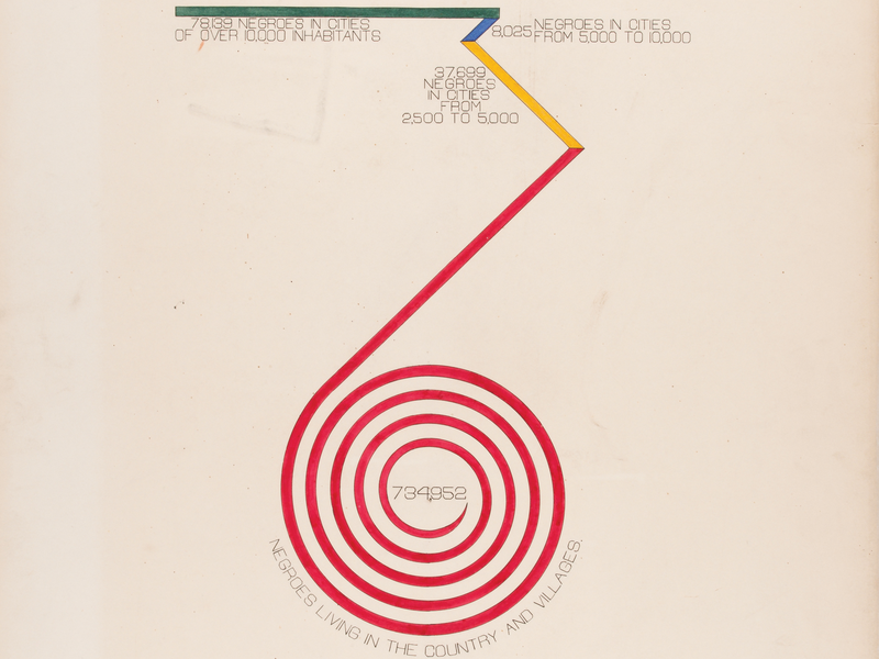
Two studies emerged. ‘The Georgia Negro’, comprising 32 handmade graphs and charts, captured a living community in numbers: how many black children were enrolled in public schools, how far family budgets extended, what people did for work, even the value of people’s kitchen furniture.
The other, a set of about 30 statistical graphics, was made by students at Atlanta University and considered the African American population of the whole of the United States. Du Bois was struck by the fact that the illiteracy of African Americans was ‘less than that of Russia, and only equal to that of Hungary’. A chart called ‘Conjugal Condition’ suggests that black Americans were more likely to be married than Germans.
The Exposition Universelle of 1900 brought all the world to the banks of the Seine. Assorted Africans, shipped over for the occasion, found themselves in model native villages performing bemused and largely made-up rituals for the visitors. (Some were given a truly lousy time by their bosses; others lived for the nightlife.) Meanwhile, in a theatre made of plaster and drapes, the Japanese geisha Sada Yacco, wise to this crowd from her recent US tour, staged a theatrical suicide for herself every couple of hours.
The expo also afforded visitors more serious windows on the world. Du Bois scraped together enough money to travel steerage to Paris to oversee his exhibition’s installation at the Palace of Social Economy.
He wasn’t overly impressed by the competition. ‘There is little here of the “science of society”,’ he remarked, and the organisers of the Exposition may well have agreed with him: they awarded him a gold medal for what Du Bois called, with justifiable pride, ‘an honest, straightforward exhibit of a small nation of people, picturing their life and development without apology or gloss, and above all made by themselves’.
At the House of Illustration in London you too can now follow the lines, bars and spirals that reveal how black wealth, literacy and land ownership expanded over the four decades since emancipation.
His exhibition also included what he called ‘the usual paraphernalia for catching the eye — photographs, models, industrial work, and pictures’, so why did Du Bois include so many charts, maps and diagrams?
The point about data is that it looks impersonal. It is a way of separating your argument from what people think of you, and this makes it a powerful weapon in the hands of those who find themselves mistrusted in politics and wider society. Du Bois and his community, let’s not forget, were besieged — by economic hardship, and especially by the Jim Crow laws that would outlive him by two years (he died in 1963).
Du Bois pioneered sociology, not statistics. Means of visualising data had entered academia more than a century before, through the biographical experiments of Joseph Priestly. His timeline charts of people’s lives and relative lifespans had proved popular, inspiring William Playfair’s invention of the bar chart. Playfair, an engineer and political economist, published his Commercial and Political Atlas in London in 1786. It was the first major work to contain statistical graphs. More to the point, it was the first time anyone had tried to visualise an entire nation’s economy.
Statistics and their graphic representation were quickly established as an essential, if specialised, component of modern government. There was no going back. Metrics are a self-fertilising phenomenon. Arguments over figures, and over the meaning of figures, can only generate more figures. The French civil engineer Charles Joseph Minard used charts in the 1840s to work out how to monetise freight on the newfangled railroads, then, in retirement, and for a hobby, used two colours and six dimensions of data to visualise Napoleon’s invasion and retreat during the 1812 campaign of Russia.
And where society leads, science follows. John Snow founded modern epidemiology when his annotated map revealed the source of an outbreak of cholera in London’s Soho. English nurse Florence Nightingale used information graphics to persuade Queen Victoria to improve conditions in military hospitals.
Rightly, we care about how accurate or misleading infographics can be. But let’s not forget that they should be beautiful. The whole point of an infographic is, after all, to capture attention. Last year, the House of Illustration ran a tremendous exhibition of the work of Marie Neurath who, with her husband Otto, dreamt up a way of communicating, without language, by means of a system of universal symbols. ‘Words divide, pictures unite’ was the slogan over the door of their Viennese design institute. The couple’s aspirations were as high-minded as their output was charming. The Neurath stamp can be detected, not just in kids’ picture books, but across our entire designscape.
Infographics are prompts to the imagination. (One imagines at least some of the 50 million visitors to the Paris Expo remarking to each other, ‘So that’s how the negroes of Georgia live!’) They’re full of facts, but do they convey them more effectively than language? I doubt it. Where infographics excel is in eliciting curiosity and wonder. They can, indeed, be downright playful, as when Fritz Kahn, in the 1920s, used fast trains, street traffic, dancing couples and factory floors to describe, by visual analogy, the workings of the human body.
Du Bois’s infographics aren’t rivals to Kahn or the Neuraths. Rendered in ink, gouache watercolour and pencil, they’re closer in spirit to the hand-drawn productions of Minard and Snow. They’re the meticulous, oh-so-objective statements of a proud, decent, politically besieged people. They are eloquent in their plainness, as much as in their ingenuity, and, given a little time and patience, they prove to be quite unbearably moving.