Heading north

Reading Forecast by Joe Shute for the Telegraph, 28 June 2021

As a child, journalist Joe Shute came upon four Ladybird nature books from the early 1960s called What to Look For. They described “a world in perfect balance: weather, wildlife and people all living harmoniously as the seasons progress.”

Today, he writes, “the crisply defined seasons of my Ladybird series, neatly quartered like an apple, are these days a mush.”

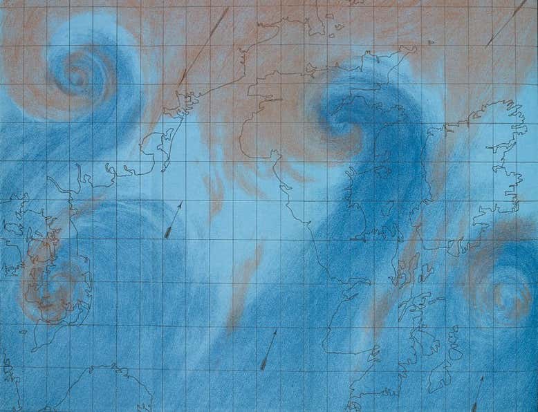
Forecast is a book about phenology: the study of lifecycles, and how they are affected by season, location and other factors. Unlike behemothic “climate science”, phenology doesn’t issue big data sets or barnstorming visualisations. Its subject cannot be so easily metricised. How life responds to changes in the seasons, and changes in those changes, and changes in the rates of those changes, is a multidimensional study whose richness would be entirely lost if abstracted. Instead, phenology depends on countless parochial diaries describing changes on small patches of land.

Shute, who for more than a decade has used his own diary to fuel the “Weather Watch” column in the Daily Telegraph, can look back and see “where the weather is doing strange things and nature veering spectacularly off course.” Watching his garden coming prematurely to life in late winter, Shute is left “with a slightly sickly sensation… I started to sense not a seasonal cycle, but a spiral.” (130)

Take Shute’s diary together with countless others and tabulate the findings, and you will find that all life has started shifting northwards — insects at a rate of five metres a day, some dragonflies at between 17 and 28 metres a day.

How to write about this great migration? Immediately following several affecting and quite horrifying eye-witness scenes from the global refugee crisis, Shute writes: “The same climate crisis that is rendering swathes of the earth increasingly inhospitable and driving so many young people to their deaths, is causing a similar decline in migratory bird populations.”

I’m being unkind to make a point (in context the passage isn’t nearly so wince-making), but Shute’s not the first to discover it’s impossible to speak across all scales of the climate crisis at once.

Amitav Ghosh’s 2016 The Great Derangement is canonical here. Ghosh explained in painful detail why the traditional novel can’t handle global warming. Here, Shute seems to be proving the same point for non-fiction — or at least, for non-fiction of the meditative sort.

Why doesn’t Shute reach for abstractions? Why doesn’t he reach for climate science, and for the latest IPCC report? Why doesn’t he bloviate?

No, Shute’s made of sterner stuff: he would rather go down with his corracle, stitching together a planet on fire (11 wildfires raging in the Arctic circle in July 2018), human catastrophe, bird armageddon, his and his partner’s fertility problems, and the snore of a sleeping dormouse, across just 250 pages.

And the result? Forecast is a triumph of the most unnerving sort. By the end it’s clearly not Shute’s book that’s coming unstuck: it’s us. Shute begins his book asking “what happens to centuries of folklore, identity and memory when the very thing they subsist on is changing, perhaps for good”, and the answer he arrives at is horrific: folklore, identity and memory just vanish. There is no reverse gear to this thing.

I was delighted (if that is quite the word) to see Shute nailing the creeping unease I’ve felt every morning since 2014. That was the year the Met Office decided to give storms code-names. The reduction of our once rich, allusive weather vocabulary to “weather bombs” and “thunder snow”, as though weather events were best captured in “the sort of martial language usually preserved for the defence of the realm” is Shute’s most telling measure of how much, in this emergency, we have lost of ourselves.

A pontiff set upon by angels

Watching Victor Kossakovsky’s Aquarela for New Scientist, 15 January 2020.

WINTER in southern Siberia. By a long-winded, painstaking method involving levers, ropes and a fair amount of cursing, vehicles that have fallen through the thawing ice of Lake Baikal can be hauled back onto the surface.

The crew working on Aquarela were filming one such operation when an SUV shot past in a shower of ice, then plunged nose-first into the freezing water, killing one of its occupants.

There is nothing exploitative about the footage that, after much soul-searching, Russian film-maker Victor Kossakovsky used to front his poetic, narrative-less documentary about the power and weirdness of water. Locals and police slip and topple, hacking frantically at the ice, while the accident’s sole survivor stumbles about, frenzied with terror and getting in everyone’s way.

Kossakovsky is one of those rare documentary makers who still believes that the camera alone can capture truth. His expensive and time-consuming method of waiting, watching and witnessing the world is rarely supported by an industry obsessed with narratives and sound bites. Bravo, then, to Participant Media and the film’s many other backers, large and small, for Aquarela: the strangest, most powerful eco-documentary you are ever likely to see.

Captured at a staggering 96 frames per second, Aquarela‘s tracking shots, even in extreme close-up, are completely flicker-free. This makes them surreally present, in a way that demolishes scale and has you gripping the arms of your chair. Virtually no cinemas are equipped to screen such footage: this is a film made with an eye to posterity, and the plaudits that come with being a cinematic first.

Just as much study – and, no doubt, expense – has gone into the super-stabilisation of the camera used to capture the swells of a storm-tossed mid-Atlantic. If ever a present-day sequence could recreate the urban myth surrounding L’Arrivée d’un train en gare de La Ciotat, in which early audiences were convinced an on-screen train was going to drive into them and fled to the back of the cinema, it is a ride over one of Aquarela‘s impending waves.

Why recommend a film that no cinema chain can yet screen properly? Buying the Blu-Ray disc or watching it on a streaming service (we will tell you when it arrives in our Don’t Miss column) is likely to convey only a fraction of its magic. But that fragment is jaw-dropping. After so many eco-docs, with their predictable 5-second glimpses of calving icebergs, here, finally, is a film that lingers on the berg as it sinks and rises, turns and crumbles, until an ice fragment floats by that looks for all the world like a pontiff set upon by angels.

This is a film that makes even a placid ocean surface strange, as oblique light catches the ripples within each little wave. Those ripples, in such a harsh, angled, almost monochrome light, resemble the stress fractures you find in flint or bottle glass. As such, the water, for all its movement, looks like a weirdly animated mineral, and those ocean swells really do look like mountains – the cliche made vivid at last.

This isn’t a film about our relationship with water. From continent to continent, glacier to ocean, burst dam to waterfall, Aquarela is about water’s indifference to any relationship we might try to strike up with it. It is a most disconcerting film.

Annihilating France

Visiting Beautiful Science: Picturing Data, Inspiring Insight at the Folio Society Gallery, British Library, London, for new Scientist. 

In a small exhibition space built entirely of nooks and crannies, Johanna Kieniewicz, the British Library’s science curator, has created a surprising display.

Take for example, the opening image of a zoomable “tree of life” by James Rosindell, a biodiversity theorist from Imperial College London. It looks innocuous enough: it might belong in a children’s picture book. But the wealth of visual and textual information sewn into every scale of the map proves staggering. Life is vast.

Along with the intellectual surprises, there are some historical ones. What looks like a satellite image of global atmospheric circulation turns out, on closer inspection, to date from 1863: a print from The Weather Book by Robert FitzRoy (sometime captain of the Beagle and a visionary climatologist).

But perhaps the best-judged exhibit is also the least showy: a well-constructed video of interviews dealing with all the tricky questions about data visualisation in one place. Just how scientific is it? Is it really beautiful? Or distracting? And what about the underlying assumptions?

Having addressed these very necessary questions so economically, Beautiful Science can, and does, deliver on its title.

Scientific visualisation began, we learn, in the 17th century with the weather records of sea captains. Neatly rendered on an in-house computer, these records foreshadow NASA’s deliriously blue Perpetual Ocean video of 2011. This unforced pairing of historical and recent exhibits turns out to be a real strength.

Some early visualisations are predicated on ideas that turned out to be wrong. For example, the moon has little effect on the weather, and cholera is not spread by “bad air”. The data used to explore these ideas, being perfectly valid, can still reveal different insights to later observers.

This is the real strength of visualisation: it suggests interesting correlations without getting snarled up in language, which by its very nature tends to slip causation into every argument, whether you mean it to or not.

Because good visualisations give the viewer the chance to interpret things quite freely, Beautiful Science turns out to be, in the best sense, a playful exhibition. And toying around with the global epidemic and mobility model, I couldn’t for the life of me build a scenario that didn’t annihilate France.

Over all, covering climate change, public health and evolution, the exhibition gets the visitor asking the right sort of critical questions about how we communicate science.