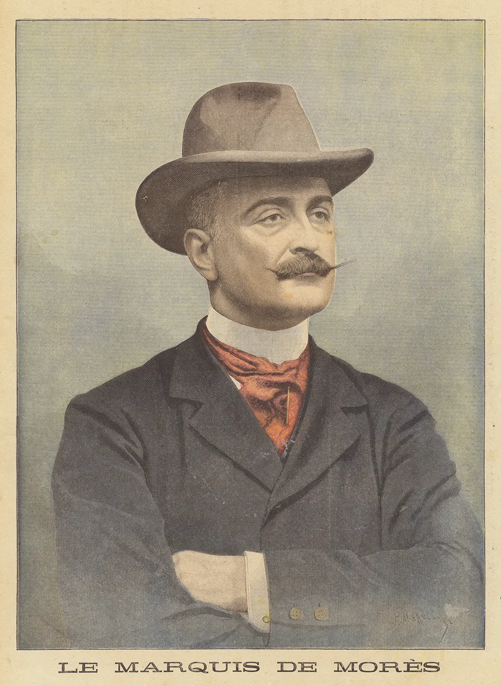
The Marquis de Morès was a man of many abilities, but balancing a cheque-book was not one of them. Bested (savaged, frankly) by the Chicago meat-packing lobby, frustrated in his attempt to build a railroad across Indochina, the French soldier, duellist and self-styled “economist” returned home in 1886, caused absolute havoc, and invented fascism (if we let the author have his way) — only to meet nemeses much closer to home. His father-in-law went to court to seperate his daughter’s finances from those of her husband; a family council took charge of Mores’s money; at last it came out that this tireless scourge of Jewish usury had borrowed from lobbyist and conman Cornelius Herz, one of the leading (and Jewish) players in the Panama scandal. Publicly embarrassed, Morès took himself off to Algeria and set about planting an unsanctioned French flag further and further into the Sahara, where he and his small party came to grief at last, massacred by local tribesmen.
It was the Jews what really done it, or so his admirers claimed, just as it was Jews had blighted Morès’s innovative bid to transport already slaughtered beef cattle, rather than live ones, across the Mid-West.
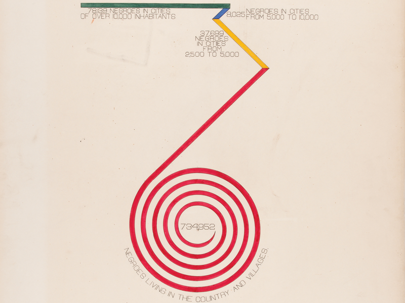
Butchers in New York and Paris, bankers, politicians, officers in the French army (this book reaches its climax, and Morès his nadir, amidst the Dreyfuss affair) — if they were Jews, you can be sure they were out to get him.
Italian historian Sergio Luzzatto assembles historical vistas in pointilliste style, through the details of lives of carefully selected individuals. This is not so much Carlyle’s “great man” theory as “A History of Europe in 100 Foibles”. With Mussolini and Primo Levi hanging off his belt, Luzzatto now turns to Morès — and what a peculiar choice he is: not a thinker, not an intellectual, not a writer, not a “creative” of any sort, not successful, not celebrated, and, to top it all, not pleasant.
More timid intellects might trace the roots of Europe’s far right to syndicalism, corporatism, anticapitalism and medievalism. Luzzatto turns his back entirely on the sort of history that would turn politics into a sort of bloodless debating club, and goes for the jugular. The far right makes no sense without antisemitism; and Luzzatto lays out the accidents, contingencies and affordances that have baked antisemitism into any and every attempt to unweave time and undream the market-driven world.
The First Fascist is a book that shines more in retrospect than in the act of reading: a book of minutiae that, once ingested, may change your view of fin de siecle history.
Napoléon III’s disastrous six-week war against Prussia in 1870 sent the French government lurching from one crisis to another. There were so many different factions in its Chamber of Deputies, all governments ended up being coalitions, and it was quite usual to find a new government boasting nearly all the same ministers as the previous one. Extremist factions of wildly different stripes agreed on this: there had to be a more direct and visceral connection between the state and its people.
Morès was one of several who threw their hat into that particular ring. (A butterfly flaps its wings, and Luzzatto finds himself writing about Boulanger, or Barrès, or Déroulède, or Delahaye). Was Morès the single pivot on which European history turned? Luzzatto is too measured to claim anything so crass.
But I’m not, and here’s the Hollywood version: Mores’s nationalist-sociaist ideology — a synthesis of vigilante violence, anti-capitalist populism, and the cult of the “strong man” — did not form in the salons of Paris, but in the slaughterhouses of Medora, North Dakota. He backed to the hilt (and damn-near into prison) the Montana Stranglers’ ruthless killing of cattle rustlers. Technically, this was murder. Practically, it was the removal of murderers and very useful to mankind (and don’t take my word for it, that’s Morès’s neighbour Teddy Rooseveldt speaking). Morès viewed the badlands as a space to resurrect a feudal order where he was the lord, the cowboys were his serfs, and the law was irrelevant.
Bringing the “cowboy style” to the refined streets of Paris (down to the revolver and the hat), Morès tried to recreate the Montana Stranglers in Paris using newsboys and butchers…
Ah, but here, sad to say, the wheels of our gay little cart come flying off, because, as Luzzatto himself observes, although Morès brought an distinctly American sensationalism to French politics, and surrounded himself with butchers and newsboys, this Chicago-hardened populist thug ”seemed disinclined to organise them into real squads with any real purpose of action — into a kind of paramilitary that could be deployed in the streets to exercise a systemic use of force.”
One can only deplore the way Luzzatto lets the air out of his tyres in service of the truth — does he not want to shift copies? But one can only admire his rejection of “intellectual history” in favour of the real thing: a history composed of actions (inescapably bloody) and consequences (irretrievably dismal).