“Ah, bankers, students, workers, officials, servants, you are the cock-suckers of the useful, the masturbators of necessity. I shall never work. My hands are pure.” — Louis Aragon
Episode 3 of the Baillie Gifford Prize’s ReadSmart Podcast, out Friday 29 May, has me discussing trends in artificial intelligence with the mathematician Hannah Fry. Razia Iqbal is in the chair. Available from all high-class streaming emporia; this is the Spotify one spoti.fi/3bJa5v7
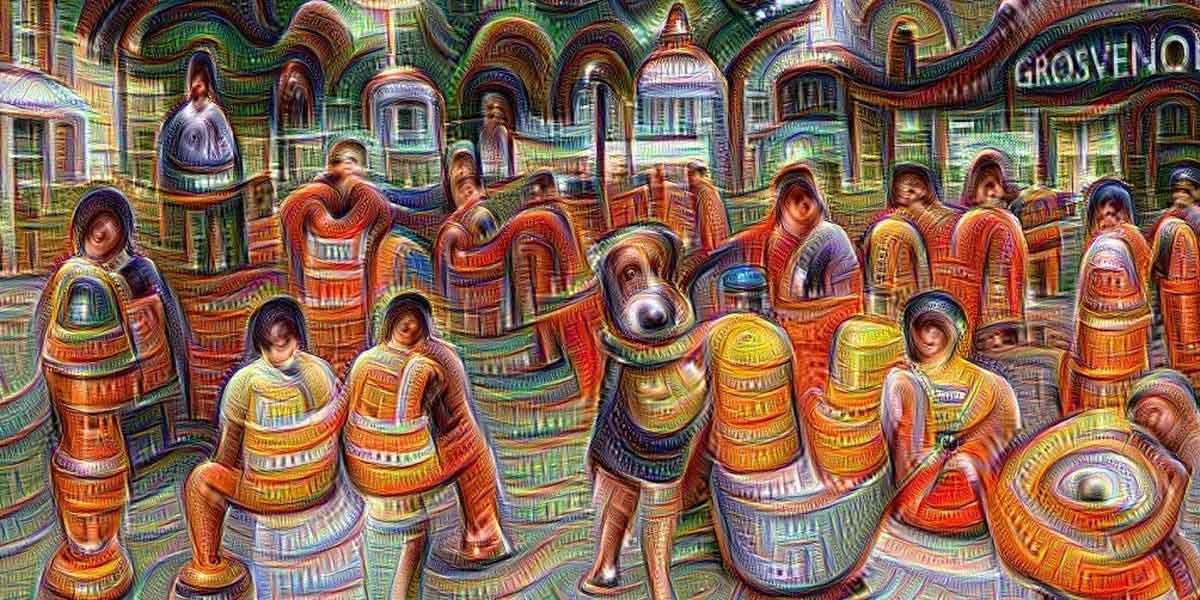
Is Michel Comte’s past celebrity a burden? “You carry it on your fucking back,” he says. “It took ten years for people to notice I was visiting Africa for months at a time. It took twenty years before people starting listening to what I’ve been saying since my first gallery show.”
At breakfast in a Paris café, the artist and composer Ryoji Ikeda looks ageless in a soft black cap and impenetrably dark glasses, dressed all in black so as to resemble the avatar from an indie video game.
His work too is severe, the spectrum reduced to grayscale, light to pixels, sound to spikes. Yet Ikeda is no minimalist: he is interested in the complexity that explodes the moment you reduce things to their underlying mathematics.
An artist in light, video, sound and haptics (his works often tremble beneath your feet), Ikeda is out to make you dizzy, to overload your senses, to convey, in the most visceral manner (through beats, high volumes, bright lights and image-blizzards) the blooming, buzzing confusion of the world. “I like playing around with the thresholds of perception,” he says. “If it’s too safe, it’s boring. But you have to know what you’re doing. You can hurt people.”
Ikeda’s stringent approach to his work began in the deafening underground clubs of Kyoto. There, in the mid-1990s, he made throbbing sonic experiences with Dumb Type, a coalition of technologically adept experimental artists. And he can still be this immediate when he wants to be: visitors to the main pavilion at this year’s Venice Biennale found themselves squeezed through “Spectra III” (first assembled in 2008), a white corridor so evenly and brightly lit your eyes rejected what they saw, leaving you groping your way out as if in total darkness.
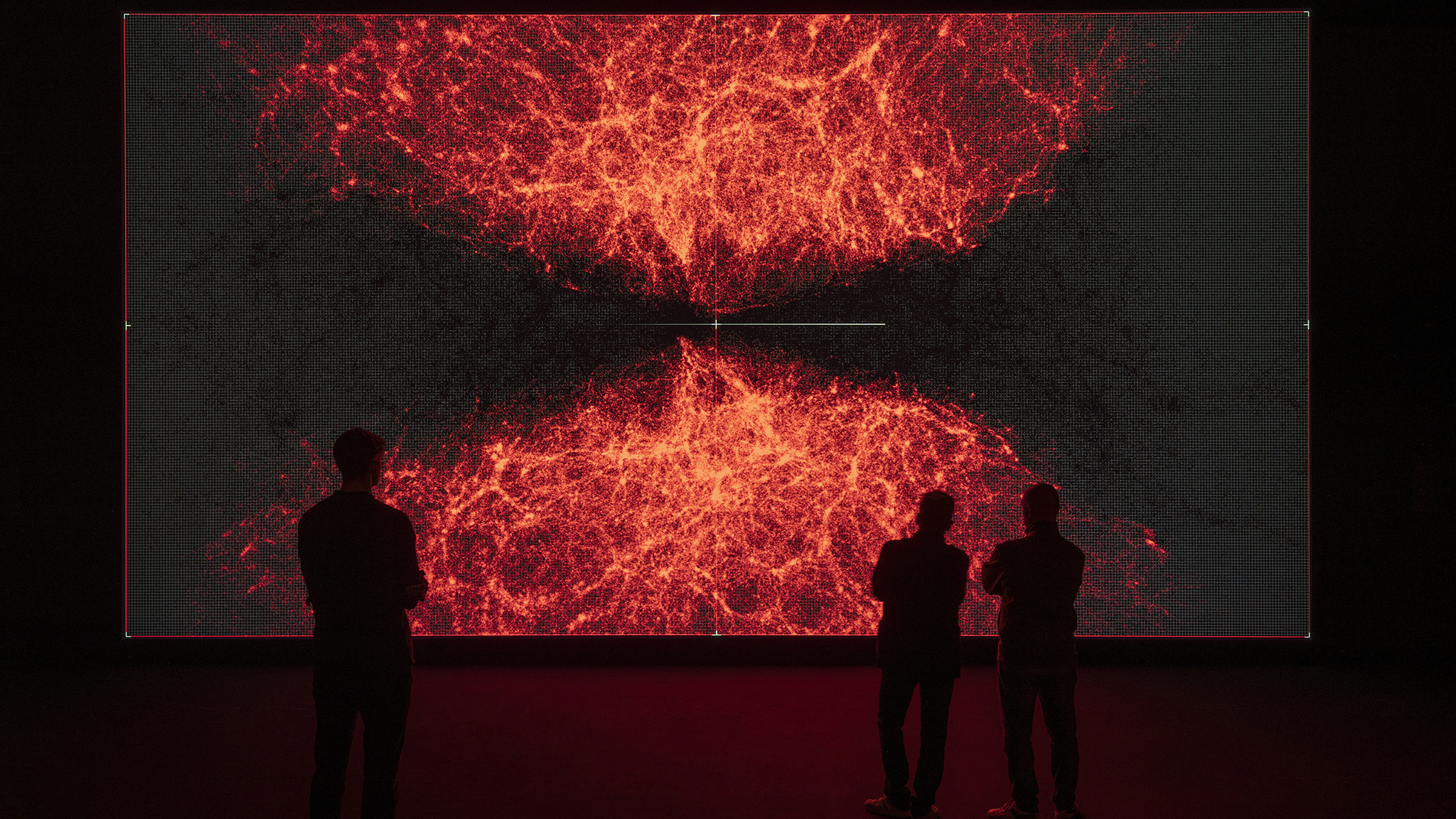
These days, though, he is better known for installations that go straight for the cerebral and mathematical. His ongoing “data-verse” project consists of three massively complex computer animations. The first part, “data-verse 1”, is based on static data from CERN, Nasa, the Human Genome Project and other open sources. “data-verse” contains animations, tables, graphs, matrices, 3D models, Lidar projections, maps. But what is being depicted here: something very small, or very big? There’s no way to tell. The data have peeled away from the things they represent and are dancing their own pixelated dance. Numbers have become rivers. At last the viewer’s mind surrenders to the flow and rhythm of this frenetic 12-minute piece.
It would be polite to say that “data-verse” is beautiful — but it isn’t. Rather, it is sublime, evoking a world stripped back to its mathematical bones. “If it’s beautiful, you can handle it; the sublime, you cannot,” Ikeda says. “If you stand in some great whited-out landscape in Lapland, the Sahara or the Alps, you feel something like fear. You’re trying to draw information from the world, but it’s something that your brain cannot handle.”
Similarly, the symmetrical, self-similar “data-verse” is an artwork that your mind struggles to navigate, tugging at every locked door in an attempt to regain purchase on the world.
“You try to understand, but you give up — and then it’s nice. Because now you are experiencing this piece the same way you listen to music,” Ikeda says. “It’s simply a manipulation of numbers and relationships, like a musical composition. It’s very different from the sort of visual art where you’re looking through the surface of the painting or the sculpture to see what it represents.”
When we meet, Ikeda is on his way to Tokyo Midtown, and the unveiling of “data-verse 2” (this one based on dynamic data “like the weather, or stock exchanges”). The venue is Beyond Watchmaking, an exhibition arranged by his patron, the eccentric family-run Swiss watchmaker Audemars Piguet. The third part of data-verse is due to be unveiled next year.
It is a vastly ambitious project but Ikeda has always tended towards the expansive. He pulls out of his suitcase an enormously heavy encyclopedia of sonic visualisations. “I wanted you to see this,” he says with a touching pride, leafing through page after page of meticulously documented oscilloscoped forms. Encyclopedia Cyclo.id was compiled with his friend Carsten Nicolai, the German multimedia artist, in 1999. Each figure here represents a particular sound. The more complex figures resemble watch faces. “It’s for designers, really,” Ikeda shrugs, shutting the book, “and architects.”
And the point of this? That lawful, timeless mathematics underpins the world and all our activities within it.
Ikeda spends 10 months out of every 12 travelling: “I really work in the airport or the kitchen. I don’t like the studio.” Months spent working out problems on paper and in his head are interspersed with intense, collaborative “cooking sessions” with a coterie of exceptional coders — creative sessions in which all previous assumptions are there to be challenged.
However, “data-verse” is likely to be Ikeda’s last intensely technological artwork. At the moment he is inclining more towards music and has been arranging some late compositions by John Cage in a purely acoustic project. As comfortable as he is around microphones, amps and computers, Ikeda isn’t particularly affiliated to machines.
“For a long time, I was put in the media-art category,” he says, “and I was so uncomfortable, because so much of that work is toylike, no depth to it at all. I’m absolutely not like this.”
Ikeda’s art, built not from things but from quantities and patterns, has afforded him much freedom. But he is acutely aware that others have more freedom still: “Mathematicians,” he sighs, “they don’t care about a thing. They don’t even care about time. It’s very interesting.”
Steel flowers bend in a ‘breeze’ generated by magnetic pendulums. This is the first thing you see as you enter Tate Modern’s survey show. And ‘Magnetic Fields’ (1969) is pretty enough: the work of this self-taught artist, now in his nineties, has rarely been so gentle, or so intuitive.
But there’s a problem. ‘I would like to render [electromagnetism] visible so as to communicate its existence and make its importance known,’ Takis has written. But magnetism hides in plain sight. A certain amount of interference is necessary before it will reveal itself.
Does the interference matter? Does the fact that gallery assistants have to activate this work every ten minutes spoil the ‘cosmicness’ of Takis’s art? The sculptor Alberto Giacometti thought so: ‘One day, during one of my exhibitions, he told me that he didn’t agree with my use of electricity for some of my works,’ Takis recalled in an interview in 1990. ‘He disliked the fact that if you switched off the power, the work would cease to function.’
Why Takis’s pieces should prompt such a finicky response isn’t immediately obvious. What do we expect of this stuff? Perpetual motion? One moment we wonder at the invisible force that can suspend delicate metal cones fractions of an inch above the surface of a canvas. The next moment, we’re peering where we shouldn’t, trying to figure out the circuitry that keeps a sphere swinging over a steel wire.
We’re presented with many wonders — objects rendered weightless, or put into permanent vibration. And as the show progresses (it’s surprisingly large, designed to unfold around corners and spring surprises at your back) the work gets less intuitive, and a lot louder. A pendulum, orbiting a strong, floor-mounted magnet, whips eccentrically and not at all gently about its centre of attraction. It’s like nothing in visible nature. There’s no ‘magnetic breeze’ here, no ‘force like gravity’, just the thing, the weirdness itself. Now we’re getting somewhere.
Born Panayiotis Vassilakis in 1925, Takis discovered his alchemical calling early. One memoir recalls how ‘as a small boy, he would bury pieces of broken glass and other such oddments in the ground to see what happened to them when he impatiently dug them out a couple of days later’. In 1954 he moved to Paris, where he fell in with Marcel Duchamp and Yves Tanguy. In London he inspired a group of young artists who went on to create the politically radical Signals London gallery. In America the beats admired him, the Massachusetts Institute of Technology gave him a fellowship, and the composer John Cage encouraged his shamanism. (‘I cannot think of my work as entirely my work,’ Takis writes. ‘In a sense, I’m only a transmitter.’)
Takis treads the same awkward line in visual art that Cage did in music. Cage promised us that behind the music of signs lay some sort of sonic essence. But his snark hunt proved rather dull. Takis’s own search ends more happily, if only because the eye, in its search for signs, doesn’t admit defeat nearly as quickly as the ear. Takis’s traffic signals, stripped of context and perched on tall poles, become eyes full of sadness and yearning. They still mean something. They’re still signs of something.
Made from oddments plucked from boxes of army and air-force surplus on Tottenham Court Road, some of Takis’s more engineered work has dated. We look at it as a sort of industrial archaeology. Its radicalism, its status as ‘anti-technology’, is hard to fathom.
But the simpler pieces need no translation. They are (suitably enough, for an artist whose works often screech and rattle) a sort of visual equivalent of music. They do not mean anything. They are meaning. They reflect harmonious relationships between energy and space and mass. Takis’s work is like his subject: it hides in plain sight.
Plastics — even venerable, historically eloquent plastics — hardly draw the eye. As this show’s insightful accompanying publication (a snip at £3) would have it, ‘Plastics have no intrinsic form or texture, thus they are not materials that can be true to themselves.’ They exist within inverted commas. They can be shell-like, horn-like, stony, metallic — they do not really exist on their own behalf.
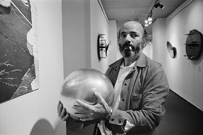
Mind you, the first vitrine in Raw Materials: Plastics at the Nunnery Gallery in east London contains an object of rare beauty: a small, mottled, crazed, discoloured sphere that looks for all the world like the planet Venus, reduced to handy scale.
It’s a billiard ball, made of the first plastic: cellulose nitrate. Its manufacture had been keenly anticipated. In the US, a $10,000 prize had been offered for anything that could replace ivory in the manufacture of billiard balls (and no wonder: a single tusk yields only three balls).
Under various brand names (Celluloid, Parkesine, Xylonite), and in spite of its tendency to catch fire (colliding snooker balls would occasionally explode), cellulose nitrate saved the elephant. And not just the elephant: plastics pioneer John Wesley Hyatt reckoned that ‘Celluloid [has] given the elephant, the tortoise, and the coral insect a respite in their native haunts; and it will no longer be necessary to ransack the earth in pursuit of substances which are constantly growing scarcer.’
The whole point of plastic is that it has no characteristics of its own, only properties engineered for specific uses. Cheaper than jade. Less brittle than bone. It’s the natural material of the future, always more becoming than being. Hence the names: Xylonite. Bexoid. Halex. Lactoid.
Unable to nail the material in words, one writes instead about its history, sociology, industrial archaeology or ecological impact. On remote islands in the Pacific, thousands of albatross chicks are starving because the parents mistake floating plastic debris for food. Stories like this conjure up a vision of vast islands of discarded plastic coagulating in the Pacific Ocean, but there aren’t any. Instead, plastics eventually fragment into ever smaller pieces that are ingested by marine animals and carried to the sea bottom. In the Mariana Trench, all crustaceans tested had plastics in their guts. So plastics rise and fall through the food chain, creating havoc as they go — a bitter irony for a material that saved the elephant and the turtle, made fresh food conveyable and modern medicine possible, and all for less than 15 per cent of global oil consumption.
What can be gained from looking at the stuff itself? Raw Materials: Plastics transcends the limitations of its material by means of a good story. The first plastics were made in the Lea Valley, not from crude oil, but from plant materials, in a risky, artisanal fashion that bore, for a while, the hallmarks of older crafts including baking, woodcutting and metalwork. Fast-forward 140 years or so and, under the umbrella term ‘bioplastics’, plant-based and biodegradable synthetic products promise to turn the wheel of development full circle, returning plastics to their organic roots. (Designer Peter Marigold’s FORMCard plastic, used here in an excellent school art project, is a starch-based bioplastic made from potato skins.) Then, perhaps, we can break the bind in which we currently find ourselves: the one in which we’re poisoning the planet with plastic in our efforts not to further despoil it.
This is the third and for my money the most ambitious of the gallery’s ongoing series of small, thoughtful exhibitions about the materials, processes and industries that have shaped London’s Lea Valley. (Raw Materials: Wood ran in 2017; Raw Materials: Textiles last year.) The show is more chronicle than catalogue, but the art, scant as it is, punches above its weight.
I was struck, in particular, by France Scott’s ‘PHX [X is for Xylonite]’, a 13-minute collage of photogrammetry, laser scanning and 16mm film. It ought, by all logic, to be a complete mess and I still haven’t been able to work out why it’s so compelling. Is it because digital artefacts, like their plastic forebears, are themselves prisoners of contingency, aping the forms of others while stubbornly refusing to acquire forms of their own?
BETWEEN now and 24 November, half a million people will visit May You Live in Interesting Times, the main art exhibition of the Venice Biennale. More than 120 years old, the Biennale is the world’s biggest and most venerable art fair. This year’s offering overflows its historical venue in the gardens on Venice’s eastern edge and sprawls across the city.
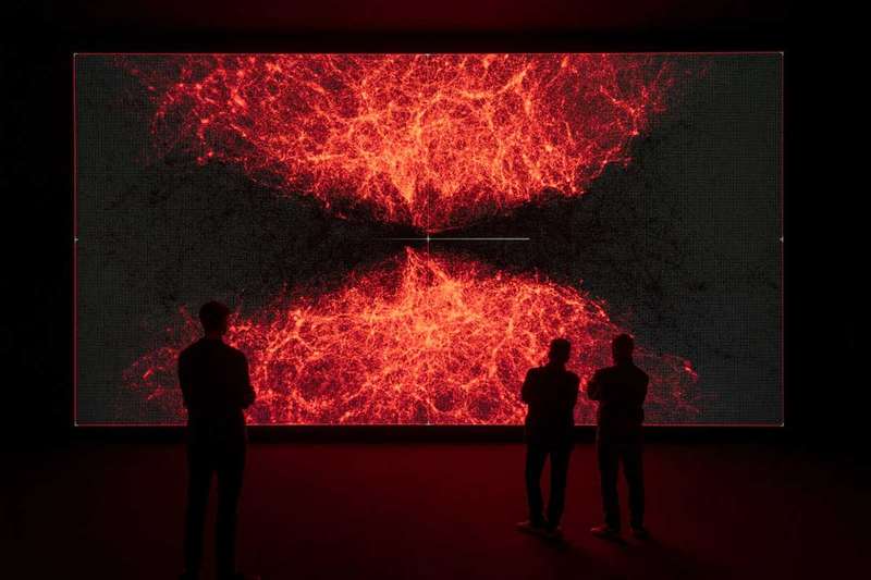
In a 300-metre-long former rope-making factory in Venice’s Arsenale, a complex of former shipyards and armouries, it is hard to miss data-verse 1 by Japanese DJ and data artist Ryoji Ikeda: the first instalment of a year-long project to realise an entire universe on a gigantic, wall-sized high-definition screen.
Back in Paris, in a studio that consists of hardly more than a few tables and laptops, Ikeda and his programmers have been peeling open huge data sets, using software they have written themselves. From the flood of numbers issuing from CERN, NASA, the Human Genome Project and other open sources, they have fashioned highly detailed abstract animations.
Ikeda is self-taught. He came to visual art from making animations to accompany DJ sets in the squats, clubs and underground parties of Kyoto, Japan. While his own musical taste was eclectic in the extreme, “from classical to voodoo”, Ikeda was drawn to house and dub: forms in which he says “the sound system is the real subject, not the music being played”.
His own “music” reduces sound to sine waves and impulses – and the animations to accompany his sets are equally minimal. “If the sine wave is the simplest expression of sound, what’s the simplest expression of light? For the scientist, that’s a complicated question, but for the artist, the answer is simple: it’s the pixel,” he says.
Ikeda’s project to reduce the world to its essentials continues: “I wondered what would happen if matter were reduced the same way.” Now Ikeda has turned himself into one of art’s curious beasts, the pure “data artist”.
Each of data-verse 1‘s 15-minute-long abstract “dances” explores the universe at a different scale, from the way proteins fold to the pattern of ripples in the cosmic background radiation. However, Ikeda’s aim is not to illustrate or visualise the universe, but to convey the sheer quantity of data we are now gathering in our effort to understand the world.
In the Arsenale, there are glimpses of this new nature. The Milky Way, reduced to wheeling labels. The human body, taken apart and presented as a sequence of what look like archaeological finds. A brain, colour-coded, turned over and over, as if for the inspection of a hyperactive child. A furious blizzard of solar images. And other less-easily identified sequences, where the information has peeled away entirely from the thing it represents, and takes on a life of its own: red pixels move upstream through flowing numbers like so many salmon.
Ikeda differs from his fellow data artists. While a generation has embraced and made art from “big data” – the kind of dynamic information flow that derives from recording a constantly changing world – Ikeda remains wedded to an earlier, more philosophical definition of data as the record of observed facts. Chaos and complexity for their own sake do not interest him. “I never use dynamic data in my work,” he says.
He did try, once. In 2014, he won a residency at the Large Hadron Collider at CERN, Switzerland. But he found the data overwhelming. “They have supercomputers and one experiment takes two years to analyse and compute,” he says, “and still it’s not really enough. They proposed I use this dynamic data, but how could one single artist handle this? We talk of ‘big data’ but no one imagines really how big it is.”
So Ikeda’s data-verse 1 project, which will take a year and two more productions to reach fruition, is founded on that most old-fashioned of ideas, a record of objective truth. It is neither easy nor cheap to realise, and is being supported by watch-makers Audemars Piguet, an increasingly powerful patron of artists who operate on the boundaries between art and science.
Last year, the firm helped Brighton-based art duo Semiconductor realise their CERN-inspired kinetic sculpture HALO. Before that, it invited lidar artist Quayola to map the Swiss valley where it has its factory.
While Audemars Piguet has an interest in art that pushes technological boundaries, Ikeda fights shy of talk of technology, or even physics. He is interested in the truth bound up in numbers themselves. In an interview with Japanese art critic Akira Asada in 2009, he remarked: “I cannot help but wonder if there are any artists today that give real consideration to beauty. To me, it is mathematicians, not artists, who epitomise that kind of individual. There is such a freeness to their thinking that it is almost embarrassing to me.”
Other highlights at the Arsenale include Dominique Gonzalez-Foerster’s Endodrome, (above) a purely virtual work, accessed through a HTC Vive Pro headset. The artist envisioned it “as a kind of organic and mental space, a slightly altered state of consciousness”. Manifesting at first as a sort of hyper-intuitive painting app, in which you use your own outpoured breath as a brush, Endodrome’s imagery becomes ever more precise and surreal. In a show that bristles with anxiety, Gonzalez-Foerster offers the festival-goer an oasis of creative contemplation.
Also at the Arsenale, and fresh from her show Power Plants at London’s Serpentine Gallery, the German artist Hito Steyerl presents This Is the Future, (above) a lush, AI-generated garden of the future, all the more tantalising for the fact that you’ll probably die there. Indeed, this being the future, you’re sure to die there. Steyerl mixes up time and risk, hope and fear, in a wonderfully sly send-up of professional future-gazing.
The Giardini, along the city’s eastern edge, are the traditional site of La Biennale Art Exhibitions since they began in 1895. They’re where you’ll find the national pavilions. Hungary possesses one of the 29 permanent structures here, and this year it’s full of imaginary cameras. They’re the work of cartoonist-turned media artist Tamás Waliczky. Some of his Imaginary Cameras and Other Optical Devices (above) are based on real cameras, others on long-forgotten 19th-century machines; still others are entirely fictional (not to mention impossible). Can you tell the difference? In any event, this understated show does a fine job of reminding us that we see the world in many, highly selective ways.
There’s quite as much activity outside the official venues of the Biennale as within them. At the Ca’ Rezzonico palazzo until 6 July, you have a chance to save an internationally celebrated artist from drowning (or not- it’s really up to you). A meticulously rendered volumetric avatar of Marina Abramović beckons from within a glass tank that is slowly filling with water, in a bid to draw attention to rising sea levels in a city which is famously sinking. Don’t knock Rising (above) till you’ve tried it: this ludicrous-sounding jape proved oddly moving.
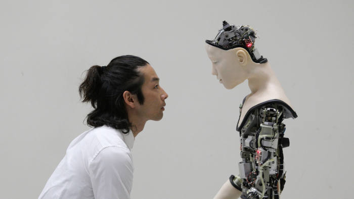
Back at the Arsenale, Ed Atkins reprises his installation Olde Food, (above) which had its UK outing at London’s Cabinet gallery last year. Atkins has spent much of his career exploring what roboticist Masahiro Mori’s famously dubbed the “uncanny valley” — the gap that is supposed to separate real people from their human-like creations. Mori’s assumption was that the closer our inventions came to resembling us, the creepier they would become.
Using commercially purchased avatars which he animates using facial recognition software, Atkins has created his share of creepy art zombies. In Olde Food, though, he introduces a new element: an almost unbearably intense compassion.
Atkins has created a world populated by uncanny digital avatars who (when they’re not falling from the sky into sandwiches — you’ll have to trust me when I say this does make a sort of sense) quite clearly yearn for the impress of genuine humanity. These near-people pray. They play piano (or try to). They weep. They’re ugly. They’re uncoordinated. They’re quite hopeless, really. I do wish I could have done something for them.
By the end of the show, I was left less impressed by artificial intelligence and more depressed that it had reduced my human worth to base matter. Had it, though? Or had it simply made me aware of how much I wanted to be base matter, shaped into being by something greater than myself? I was reminded of something that Benjamin Bratton, author of the cyber-bible The Stack, said in a recent lecture: “We seem only to be able to approach AI theologically.”
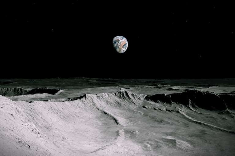
VISIT The Store X, a venue for art and design in London’s West End, and you are in for quite a journey. Wearing an HTC Vive headset, you are given an island to explore in Lunatick, a glossy, game-like virtual-reality experience that starts at Kiribati in Micronesia. For a while, you have the run of the place by means of hand controllers, although producers Acute Art plans to use EEG to let you control it with your thoughts.
Don’t get too comfortable. Wandering past a stone platform triggers the space elevator. It lifts you gently off your feet, then propels you through the stratosphere. This long, beautiful and increasingly uncanny transit carries you into the void between the moon and Earth.
Take a breath. Look around you. The geometrical relationship between the sun, Earth and its moon unwinds around you as time skews and the moon swells. Before you know it, you are skating around lunar crater rims, plummeting into craters, flying high, until, losing control again, you are flung into the sun.
Lunatick is the first joint work by British artist Antony Gormley and astrophysicist Priyamvada Natarajan from Yale University. Natarajan visualises the accretion history of black holes, and maps the granularity of dark matter by studying the way it bends light – a phenomenon called gravitational lensing. But she couldn’t resist the idea of giving space a sensual dimension by making the vastness and loneliness of the cosmos tangible.
Artist and scientist bonded over their early love of science fiction. H. G. Wells’s 1901 novel The First Men in the Moonwas Natarajan’s contribution: a fictional journey powered by the mysterious gravity-less mineral cavorite. Gormley, in his turn, recalled C. S. Lewis’s space trilogy that began with Out of the Silent Planet, in which a man travels the solar system pinned in a coffin.
Both influences emerge clearly enough in Lunatick, but the real star of the show isn’t fictional: it is the flyable lunar terrain wrestled into shape by Rodrigo Marques, Acute Art’s chief technology officer, from data sent back by NASA’s Lunar Reconnaissance Orbiter. “There’s something both moving and funny about skating over the surface of the moon,” says Gormley. “I’ve got very fond of skiing along the ridges then down into the crater bottoms.”
Gormley’s art is popular globally, not least because people find it easy to grasp. Never mind the cosmological and philosophical dimensions: what strikes the viewer is how he renders, in solid matter, the building blocks of our lives.
Gormley has been making sculptural art out of wireframes and voxels (three-dimensional pixels), even as architects and games designers having been moving away from model-making into a purely virtual 3D design space. “Until recently, I had no idea what a voxel was,” says Gormley, who has spent more than five years making oddly expressive low-resolution sculptures assembled from cubes and cuboids. His wireframe experiments (assembled from real wires and rods) are older still, dating back to the late 1990s.
Why has Gormley chosen to enter the virtual realm now? First, Lunatick was a chance to explore a medium that, he says, is “bloody useless at objects and bloody brilliant at space”. Objects, ultimately, are bodies: VR is hobbled because it can’t convey their mass and tactility. But space is different. We perceive space primarily through seeing, which means VR can convey scale and immensity to a sublime degree.
But why should an artist best known for exploring the sculptural possibilities of the human body (particularly his own) be keen on disembodied space? The image of body-as-spaceship crops up intermittently in Gormley’s work, but rarely so urgently. He says he is haunted by an image of long-haul flight, where the shutters are down and everyone is watching movies: virtual versions of human life.
“I want this piece to say to people, ‘Break out!’,” he says. “Of course we get very obsessed with human matters. But there are bigger affairs out there. Recognise your cosmic identity!”
Exhibitions hitch themselves to the 500th anniversary of Leonardo da Vinci at their peril. How do you do justice to a man whose life’s work provides the soundtrack to your entire culture? Leonardo dabbled his way into every corner of intellectual endeavour, and carved out several tasty new corners into the bargain. For heaven’s sake, he dreamt up a glass vessel to demonstrate the dynamics of fluid flow in the aortic valve of the human heart: modern confirmation that he was right (did you doubt it?) had to wait for the cardiologist Robin Choudhury and a paper written in 2014.
Daryl Green and Laura Moretti, curators of Thinking 3D at Oxford’s Weston Library, are wise to park this particular story at the far end of their delicate, nuanced, spiderweb of an exhibition into how artists and scientists, from Leonardo to now, have learned to convey three-dimensional objects on the page.
Indeed they do very good job of keeping You Know Who contained. This is a show made up of books, mostly, and Leonardo came too soon to take full advantage of print. He was, anyway, far too jealous of his own work to consign it to the relatively crude reproductive technologies of his day. Only one of his drawings exists in printed form — a stellated dodecahedron, drawn for his friend Luca Pacioli’s De Divina Proportione of 1509. It’s here for the viewing, alongside other contemporary attempts at geometrical drawing. Next to Leonardo, they are hardly more than doodles.
A few of Leonardo’s actual drawings — the revolving series here is drawn from the Royal Collection and the British Library — served to provoke, more than to inspire, the advances in 3D visualisation that followed. In a couple of months the aortic valve story will be pulled from the show, its place taken by astrophysicist Steven Balbus’s attempts to visualise black holes. (There’s a lot of ground to cover, and very little room, so the exhibition will be changing some elements regularly during the run.) When that happens, will Leonardo’s presence in this exhibition begin to feel gratuitous? Probably not: Leonardo is the ultimate Man Who Came to Dinner: once put inside your head there’s no getting rid of him.
Thinking 3D is more than just this exhibition: the year-long project promises events, talks, conferences and workshops, not to mention satellite shows. (Under the skin: illustrating the human body, which just ended at the Royal College of Physicians in London, was one of these.) The more one learns about the project, the more it resembles Stephen Leacock’s Lord Ronald, who flung himself upon his horse and rode madly off in all directions — and the more impressive the coherence Green and Moretti have achieved here.
There are some carefully selected geegaws. A stereoscope through which one can study Arthur Thomson stereographic Anatomy of the Human Eye, published in 1912. The nation’s first look at Bill Gates’s Codescope, an interactive kiosk with a touch screen that lets you explore the Codex Leicester, a notebook of Leonardo’s that Gates bought in 1994. Even a shelf full of 3D-printed objects you are welcome to fondle, like Linus with his security blanket, as you wander around the exhibition. This last jape works better than you’d think: by relating vision to touch, it makes us properly aware of all the mental tricks we have to perform, in order to to realise 3D forms in pictures.
But books are the meat of the matter: arranged chronologically along one wall, and under glass in displays that show how the same theme has been handled at different times. Start at the clean, complex lines of the dodecahedron and pass, via architecture (the coliseum) and astronomy (the Moon) to the fleshy ghastliness of the human eyeball.
Conveying depth by drawing makes geometry comprehensible. It also, and in particular, transforms three areas of fundamental intellectual enquiry: anatomy, architecture, and astronomy.
Today, when we think of 3D visualisation, we think first of architecture. (It’s an association forged, in large part, in the toils of countless videogames: never mind the plot, gawp at all that visionary pixelcrete!). But because architecture operates at a more-or-less human-scale, it’s actually been rather slow to pick up on the power of 3D visualisation. With intuition and craft skill to draw upon, who needs axonometry? The builders of the great Mediaeval cathedrals managed quite happily without any such hifalutin drawing techniques, and it wasn’t until Auguste Choisy’s Histoire de l’architecture of 1899 that a drawing style that had already transformed carpentry, machinery, and military architecture finally found favour with architects. (Arguably, the profession has yet to come down off the high this occasioned. Witness the number of large buildings that look, for all their bulk, like scale models, their shapes making sense only from the most arbitrary angles.)
Where the scale is too small or too large for intuition and common sense to work, 3D visualisation has been most useful, and most beautiful. Andreas Vesalius’s De humani corporis fabrica librorum epitome (1543) stands here for an entire genre of “fugitive sheets” — compendiums of exquisite anatomical drawings with layered flaps, peeled back by the reader to reveal the layers of the body as one might discover them during a dissection. Because these documents were practical surgical guides, they received rough treatment, and hardly any survive. Those that do (though not the one here, thank God) are often covered with mysterious stains.
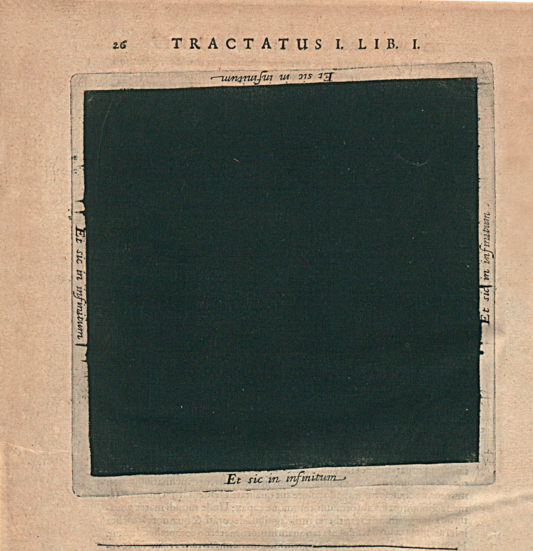
Less gruesome, but at the same time less immediately communicative, are the various attempts here to render the cosmos on paper. Robert Fludd’s black square from his Utriusque Cosmi (1617-21), depicts the void immediately prior to creation. Et sic in infinitum (“And so on to infinity”) run the words on each side of this eloquent blank.
Thinking 3D explores territories where words tangle incoherently and only pictures will suffice — then leaps giggling into a void where rational enquiry collapses and only artworks and acts of mischief like Fludd’s manage to convey anything at all. All this in a space hardly bigger than two average living rooms. It’s a show that repays — indeed, demands — patience. Put in the requisite effort, though, and you’ll find it full of wonders.
Cyril Connolly, literary lion of the 1930s, reckoned that the surest way of killing off writers was to baff on about their promise. Calling artists “visionary” might have the same effect now.
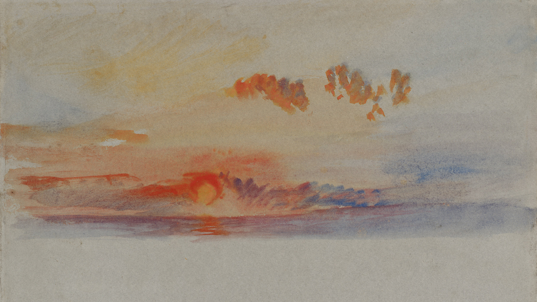
A new show at Turner Contemporary in Margate juxtaposes JMW Turner watercolours with work by Scottish-born conceptual artist Katie Paterson. The fit seems reasonable. Both artists are fascinated by light. But Turner was a visionary artist, while Paterson, born 1981, is not.. Her value (and it’s considerable) lies elsewhere.
Turner’s deft atmospheric squiggles hang next to an airfreight parcel, a shelving unit full of light bulbs and several thousand photographic slides depicting nothing. Paterson defends the wheeze with spirit: “I don’t find my work itself scientific,” she writes, on wall information at the head of the exhibition. “It deals with phenomena and matter, space-time, colour and light, the natural world as materials. Like Turner’s work, it is rooted in sensory experience.”
True, you can find sensory experience if you go looking for it. Her 2007 piece “Earth-Moon-Earth” used Morse code to bounce the score of Beethoven’s Moonlight Sonata off the Moon. An automated piano performs the rather gappy version that survived the round-trip. The moment you wonder where the missing notes went, you enter dreamland. 289 replacement light bulbs sit ready to power Light bulb to Simulate Moonlight (2008) through the course of an average human lifetime. They are tuned to exactly recreate the effulgence of a full moon. I stepped into the installation expecting nothing, only to be propelled in my imagination back to the night walks of my childhood.
But sensory experience doesn’t sit at the heart of every Paterson work, or even many of them.
There’s lots of precision. “It needs to be accurate to be imagined,” says the artist of a 2008 wheeze in which people phoned up Iceland’s Vatnajökull glacier to hear it melting in real time. If all you got was the artist splashing about in her kitchen sink, what would be the point of the work?
Her literalistic approach pushes Paterson into entertaining contortions. Alongside her concern for accuracy and truth, I think we should add a love of logistics. Second Moon (2013-14), a fragment of the Moon sent on a year-long journey counterclockwise around the earth via air freight, is a game of scale in which human and astronomical perspectives vie for contention. Other projects haven’t gone as smoothly. For five years Paterson sent letters of condolence to friendly astronomers, marking the deaths of individual stars. Dying Star Letters (2011-present) threatened to overwhelm her, however as improvements in observation caused her inbox to overflow with stellar deaths.
A core of necessary failure is present in many of Paterson’s pieces. Some projects are threatened by technological obsolescence. The 2,200 slides of empty space that make up The History of Darkness (begun in 2010) can only be added to for as long as someone makes slides (they’re already difficult to get hold of). A brand-new piece for this exhibition is a spinning wheel depicting the overall colour balance of the universe throughout its history. Its inks are pinpoint-accurate for now, but in two years’ time, when they have faded ever so slightly, what will The Cosmic Spectrum (2019) be worth?
Turner never had this problem. His criterion of truth was different. Paterson cares about measurement. He cared about witness. An honestly witnessed play of light against a cloud can be achieved through the right squiggle. An accurate measurement of the same phenomenon must be the collaborative work of meteorologists, atmospheric scientists, astronomers, colour scientists, and who knows how many other specialists, with Paterson riding everyone’s coat-tails as a sort of tourist.
As a foil for Paterson, we need someone who invents the world out of words, who thinks in conceits and metaphors, and who explores them with an almost naive diligence.
We need John Donne. “On a round ball / A workman that hath copies by, can lay / An Europe, Afric, and an Asia, / And quickly make that, which was nothing, all”. These lines from A Valediction: of Weeping come far closer to defining Paterson’s practice than anything Turner can offer. Donne’s Holy Sonnets, especially, are full of the sorts of questions that power Paterson’s art. “Thou hast made me, and shall thy work decay?” “Why are we by all creatures waited on?” “What if this present were the world’s last night?”
Mounted on the wall of Turner Contemporary, Paterson’s ideas include “The universe rewound and played back in real time;” “A wave machine hidden inside the sea;” “A foghorn set off at sea every time a star dies.” Not content with setting down her ideas in words (though you can buy a book of them here, printed in ink mixed with ground-up meteorite), Paterson tries to make the more doable ones actually happen. Her artworks are the koans of Zen meditative practice made real — or as real as the world allows.
Paterson’s out to celebrate the hugeness of our imaginations, while recognising our physical and temporal littleness. She’s not visionary; she’s metaphysical. The show’s terrific, but Turner’s not the right foil.