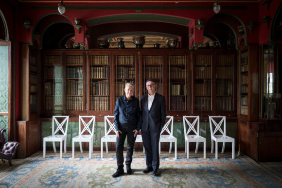
Is Michel Comte’s past celebrity a burden? “You carry it on your fucking back,” he says. “It took ten years for people to notice I was visiting Africa for months at a time. It took twenty years before people starting listening to what I’ve been saying since my first gallery show.”
Category Archives: art
Can you use a bottle opener?
EXHIBITIONS about our relationship with the environment tend to be bombastic. Either they preach doom and destruction, or they reckon our children will soon be living lives of plenty on artificial atolls.
Animalesque at the Baltic Centre for Contemporary Art in Gateshead, UK, knows better than this. In an international selection of art, sculpture and film, curator Filipa Ramos points out how little we know about other species, and how much we might still learn. With this humility comes hope that we can reform our relations with Earth.
Research has a major role to play, but it can only go so far. One unassuming TV monitor is screening a video from Tupilakosaurus, a long-running project by Danish-Greenlandic artist Pia Arke. It is a telling but not unsympathetic satirical film, in which examinations of a fossil dinosaur throw up folk tales, mangled histories and surreal mountains of paperwork as researchers try to represent and classify the Arctic’s life and history.
Often, we find out about other species only as we are evicting and replacing them. This happened to the Malayan tiger, which now numbers just some 300 wild cats in the Malay Peninsula. 2 or 3 Tigers (2015) by Singaporean artist Ho Tzu Nyen is a 19-minute, two- screen video, made using CGI and some very dodgy operatic singing, about the were-tigers of Malayan folklore. As ancestors, companions, competitors, protectors, destroyers and gods, tigers were central to the indigenous culture. Western settlers couldn’t find any there, however, until one sprang out of the forest in 1835 and attacked a hapless surveyor’s theodolite.
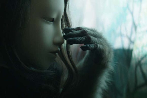
Our most stable cross-species relationships are with domesticated animals, even if they are sometimes discomforting or guilt-ridden affairs. In French artist Pierre Huyghe’s Untitled (Human Mask) (2014), a macaque explores an abandoned restaurant in Fukushima, Japan, an area gutted by the 2011 tsunami. Identifying the species of our protagonist takes a while. You would be forgiven for thinking you were watching a girl, because the macaque is wearing a wig and an eerily beautiful mask (pictured above).
The uncanny collision of categories (girl and pet, puppet and creature) only becomes more dizzying when you discover that Huyghe recruited his “star” from a Tokyo restaurant where the macaque spent many apparently happy hours working as a waiter.
It is a film of great pathos, more moving and less disturbing than this bald description suggests. It speaks to our difficulty understanding other animals, steeped as we are in human concerns.
The difficulty is real, can research help us? Degreecoordinates, Shared traits of the Hominini (humans, bonobos and chimpanzees) (2015) attempts it. For this, UK artist Marcus Coates worked with primatologist Volker Sommer to list questions relevant to all three: do you resolve conflicts using sex? Can you use a bottle opener? Do you kiss? Are you preoccupied with hierarchy and status?
Human answers vary, but so do those gleaned from studying individual chimps and bonobos. The differences between individuals of each of the three species far exceed those across species. Animalesque celebrates what we share – and what we can learn.
Breakfast with Ryoji Ikeda
Meeting the artist Ryoji Ikeda for the Financial Times, 29 November 2019
At breakfast in a Paris café, the artist and composer Ryoji Ikeda looks ageless in a soft black cap and impenetrably dark glasses, dressed all in black so as to resemble the avatar from an indie video game.
His work too is severe, the spectrum reduced to grayscale, light to pixels, sound to spikes. Yet Ikeda is no minimalist: he is interested in the complexity that explodes the moment you reduce things to their underlying mathematics.
An artist in light, video, sound and haptics (his works often tremble beneath your feet), Ikeda is out to make you dizzy, to overload your senses, to convey, in the most visceral manner (through beats, high volumes, bright lights and image-blizzards) the blooming, buzzing confusion of the world. “I like playing around with the thresholds of perception,” he says. “If it’s too safe, it’s boring. But you have to know what you’re doing. You can hurt people.”
Ikeda’s stringent approach to his work began in the deafening underground clubs of Kyoto. There, in the mid-1990s, he made throbbing sonic experiences with Dumb Type, a coalition of technologically adept experimental artists. And he can still be this immediate when he wants to be: visitors to the main pavilion at this year’s Venice Biennale found themselves squeezed through “Spectra III” (first assembled in 2008), a white corridor so evenly and brightly lit your eyes rejected what they saw, leaving you groping your way out as if in total darkness.
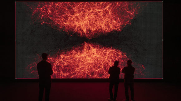
These days, though, he is better known for installations that go straight for the cerebral and mathematical. His ongoing “data-verse” project consists of three massively complex computer animations. The first part, “data-verse 1”, is based on static data from CERN, Nasa, the Human Genome Project and other open sources. “data-verse” contains animations, tables, graphs, matrices, 3D models, Lidar projections, maps. But what is being depicted here: something very small, or very big? There’s no way to tell. The data have peeled away from the things they represent and are dancing their own pixelated dance. Numbers have become rivers. At last the viewer’s mind surrenders to the flow and rhythm of this frenetic 12-minute piece.
It would be polite to say that “data-verse” is beautiful — but it isn’t. Rather, it is sublime, evoking a world stripped back to its mathematical bones. “If it’s beautiful, you can handle it; the sublime, you cannot,” Ikeda says. “If you stand in some great whited-out landscape in Lapland, the Sahara or the Alps, you feel something like fear. You’re trying to draw information from the world, but it’s something that your brain cannot handle.”
Similarly, the symmetrical, self-similar “data-verse” is an artwork that your mind struggles to navigate, tugging at every locked door in an attempt to regain purchase on the world.
“You try to understand, but you give up — and then it’s nice. Because now you are experiencing this piece the same way you listen to music,” Ikeda says. “It’s simply a manipulation of numbers and relationships, like a musical composition. It’s very different from the sort of visual art where you’re looking through the surface of the painting or the sculpture to see what it represents.”
When we meet, Ikeda is on his way to Tokyo Midtown, and the unveiling of “data-verse 2” (this one based on dynamic data “like the weather, or stock exchanges”). The venue is Beyond Watchmaking, an exhibition arranged by his patron, the eccentric family-run Swiss watchmaker Audemars Piguet. The third part of data-verse is due to be unveiled next year.
It is a vastly ambitious project but Ikeda has always tended towards the expansive. He pulls out of his suitcase an enormously heavy encyclopedia of sonic visualisations. “I wanted you to see this,” he says with a touching pride, leafing through page after page of meticulously documented oscilloscoped forms. Encyclopedia Cyclo.id was compiled with his friend Carsten Nicolai, the German multimedia artist, in 1999. Each figure here represents a particular sound. The more complex figures resemble watch faces. “It’s for designers, really,” Ikeda shrugs, shutting the book, “and architects.”
And the point of this? That lawful, timeless mathematics underpins the world and all our activities within it.
Ikeda spends 10 months out of every 12 travelling: “I really work in the airport or the kitchen. I don’t like the studio.” Months spent working out problems on paper and in his head are interspersed with intense, collaborative “cooking sessions” with a coterie of exceptional coders — creative sessions in which all previous assumptions are there to be challenged.
However, “data-verse” is likely to be Ikeda’s last intensely technological artwork. At the moment he is inclining more towards music and has been arranging some late compositions by John Cage in a purely acoustic project. As comfortable as he is around microphones, amps and computers, Ikeda isn’t particularly affiliated to machines.
“For a long time, I was put in the media-art category,” he says, “and I was so uncomfortable, because so much of that work is toylike, no depth to it at all. I’m absolutely not like this.”
Ikeda’s art, built not from things but from quantities and patterns, has afforded him much freedom. But he is acutely aware that others have more freedom still: “Mathematicians,” he sighs, “they don’t care about a thing. They don’t even care about time. It’s very interesting.”
668 televisions (some of them broken)
Visiting the Nam June Paik exhibition at Tate Modern for New Scientist, 27 November 2019
A short drive out of Washington DC, in an anonymous industrial unit, there is an enormous storage space crammed to the brim with broken television sets, and rolling stack shelving piled with typewriters, sewing machines and crudely carved coyotes.
This is the archive of the estate of Nam June Paik, the man who predicted the internet, the Web, YouTube, MOOCs, and most other icons of the current information age; an artist who spent much of his time engineering, dismantling, reusing, swapping out components, replacing old technology with better technology, delivering what he could of his vision with the components available to him. Cathode ray tube televisions. Neon. Copper. FORTRAN punch cards. And a video synthesizer, designed with the Tokyo artist-engineer Shuya Abe in 1969. The signature psychedelic video effects of Top of the Pops and MTV began life here.
Paik was born in Seoul in 1932, during the Japanese occupation of Korea, and educated in Germany, where he met the composers Karl-Heinz Stockhausen and John Cage. A fascinating retrospective show currently at London’s Tate Modern celebrates his involvement with that loose confederacy of artist-anarchists known as Fluxus. (Yoko Ono was a patron. David Bowie and Laurie Anderson were hangers-on.)
Beneath Paik’s celebrated, and celebrity-stuffed concerts, openings and “happenings” — there’s what amounts — in the absence of Paik’s controlling intelligence (he died in 2006) — to a pile of junk. 668 televisions, some of them broken. A black box the size of a double refrigerator, containing the hardware to drive one of Paik’s massive “matrices”, Megatron/Matrix, an eight-channel, 215-screen video wall, in pieces now, a nightmare to catalogue, never mind reconstruct, stored in innumerable tea chests.
The trick for Saisha Grayson, the Smithsonian American Art Museum’s curator of time-based media, and Lynn Putney its associate registrar, is to distinguish the raw material of Paik’s work from the work itself. Then curators like Tate Modern’s Sook Kyung Lee must interpret that work for a new generation, using new technology. Because let’s face it: in the end, more or less everything Paik used to make his art will end up in the bin. Consumer electronics aren’t like a painter’s pigments, which can be analysed and copied, or like a sculptor’s marble, which can, at a pinch, be repaired.
“Through Paik’s estate we are getting advice and guidance about what the artist really intended to achieve,” Lee explains, “and then we are simulating those things with new technology.”
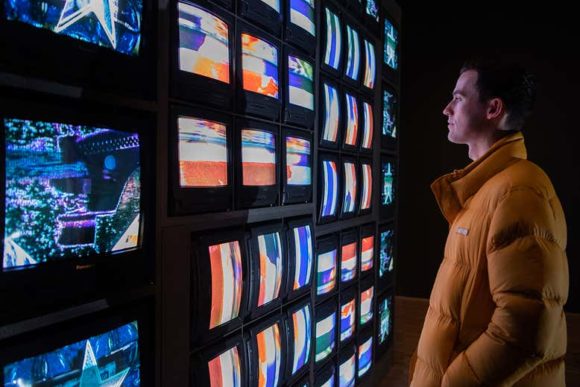
Paik’s video walls — the works by which he’s best remembered, are monstrously heavy and absurdly delicate. But the Tate has been able to recreate Paik’s Sistine Chapel for this show. Video projectors to fill a room with a blizzard of cultural and pop-cultural imagery from around the world — a visual melting pot reflective of Paik’s vision of a technological utopia, in which “telecommunication will become our springboard for new and surprising human endeavors.” The projectors are new but the feel of this recreated piece is not so very different to the 1994 original.
To stand here, bombarded by Bowie and Nixon and Mongolian throat singers and all the other flitting, flickering icons of Paik’s madcap future, is to remember all our hopes for the information age: “Video-telephones, fax machines, interactive two-way television… and many other variations of this kind of technology are going to turn the television set into an «expanded-media» telephone system with thousands of novel uses,” Paik enthused in 1974, “not only to serve our daily needs, but to enrich the quality of life itself.”
Nam June Paik: Doing away with structure once and for all
Visiting Nam June Paik at Tate Modern for the Financial Times, 24 October 2019
In 1963 one of the more notorious members of Darmstadt’s new music community, Nam June Paik, stuck around fifty strips of audio tape to the wall of the Galerie Parnass in Wuppertal in Germany.
“I wanted to let the audience… act and play by itself,” he wrote, “so I have resigned the performance of music… I made various kinds of musical instruments… to expose them in a room so that the congregation may play them as they please.”
Exhausted and alienated by the difficult musics coming out of Darmstadt — Pierre Boulez, Karlheinz Stockhausen, serialism and all the rest — visitors lapped up Paik’s free-wheeling alternative. You’d go up to the wall and rub the playback head of a dismantled tape recorder along the strips, back and forth, hunting for sounds, scratches, white noise, and hey presto! you almost became a composer.
“You have to be a lot rougher with this than you think,” a gallery worker explained, showing me the Tate’s recreated Random Access. “Really scrape.”
So I scraped. And I still couldn’t get much of a sound out of the wall-mounted speakers, and now the gallery wall is covered in dirty brown ferrous oxide streaks.
The original wasn’t very effective, either. The point was that Paik was giving you permission to play, to experiment. The Swiss artist and career eccentric Josef Beuys took Paik at his word and destroyed one of the the pianos in Paik’s first solo show with an axe. And Paik dug it; they became lifelong friends.
How do you represent an artist whose chosen medium is the audience? Who spends his time chivvying it into life by gestures, situations, shocks, pornography? How do you preserve Zen of Head (1962), in which Paik dipped his head in black ink and used it to draw a line on a length of paper? How do you honour his nearly thirty-year collaboration with the cellist and performance artist Charlotte Moorman, when Variations on a Theme by Saint-Saens (1969) involves her climbing up a ladder and vanishing into a water-filled oil drum?
The many representative works gathered by the Tate can only go so far to represent Paik’s whole practice. TV Buddha (1974) is a statuette of a seated Buddha, gazing at its own televised image. Three Eggs (1975-82) — one real, one nested in an empty television, and the third a televised image of the first egg — goes beyond mere solipsism to suggest something more complex. There are robots made from TV sets here, lines of code from early experiments at Bell Labs in New Jersey, abd TV bras and TV spectacles that seem to have fallen out of one of the calmer moments of the Japanese cyberpunk horror flick Tetsuo: The Iron Man. Newcomers would be left hopelessly at sea were it not that the Tate has also assembled a huge amount of documentation, and arranged it in a fashion that is not just informative: it’s revelatory.
Programmes. Posters. Photographs. Snatches of 8mm. Mostly they record events in tiny rooms, the visitors all crammed together, everyone laughing, having a good time. Wall by wall, case by case, we begin to understand what we missed.
Paik was a collector, a collaborator, an impresario. He urged others to enact the strangest dreams. In New York, in 1964, a topless Charlotte Moorman saws away at her cello, and Alison Knowles sheds her panties and shoves them down the throat of the least talented art critic in the room.
But Paik had other dreams, too, which which for years he kept strictly to himself. As early as 1961 he had given up studying art and was avidly reading Popular Mechanics. In Tokyo, with the engineer Shuya Abe, he co-invented the Paik-Abe Video Synthesizer. This added single-colour channels to broadcast images in real time, distorted, colorised, and superimposed multiple images, and was in essence the technology that would soon give Top of the Pops and the MTV music channel their visual signature.
Paik’s use of TV as a medium is now what everyone most remembers about him, thanks mostly to his monumental “matrices”: sculptural video collages assembled using steel gantries and neon tubing and multiple cathode-ray televisions. There’s a late example here called Internet Dream (1994), and nearby, a recreation of the video installation Sistine Chapel, which in 1993 graced the pavilion of a newly-unified Germany at the Venice Biennale. Thrown across walls and ceiling by TV projectors, disembodied David Bowies and Janis Joplins, Lou Reeds and Ryuichi Sakamotos jostle for space with parties of Gobi desert Mongolians. It’s intoxicating. Dated. Kitsch. It’s the fruit both in flower and in rot.
“Thanks to Paik,” he wrote about himself (never a good sign) ” we discover that our entire world can become sound — or rather that it *is* sound… he does away with structure once and for all.”
And, oh dear, just look where that liquefaction has led. By giving us permission to create, Paik stripped away the structures that let us receive, appreciate, and judge. His mentor John Cage did much the same for music. And around Cage and Paik, Moorman and Beuys swirled a loose, revolutionary band of brothers and sisters who, under the banner of a movement called Fluxus, abandoned the commodified single art object and sought to create democratic art; an art of the everyday.
The idea that audiences also knew something about art filled these self-appointed shamans with impatience. The audience’s ideas were third-hand, third-rate, bourgeois prisons from which they might yet be liberated.
Liberated into what, though? Into boredom? Into consumption? All you can do with this work is participate in it. Swallow it. Go see In Real Life, Olafur Eliasson’s collection of kid-friendly novelties, if you want to see where this attitude leads. It runs next door till January 5.
As I left Paik’s show, I paused by a wall-mounted TV, where pianist Manon-Liu Winter plays her own composition on Paik’s prepared piano (now too fragile to travel). The one with the barbed wire, whose keyboard once triggered sirens, heaters, ventilators and tape recorders.
Now, though, it’s just a ruined piano. Winter picks her way across its atrocious keyboard like Jack Skellington, trying to discover the secret of Christmas by measuring the presents under the tree with a tape measure. This is indeed a revelatory exhibition — but you may come away liking Paik less.
“Intelligence is the wrong metaphor for what we’ve built”
A COUPLE of days before the opening of Trevor Paglen’s latest photographic installation, From “Apple” to “Anomaly”, a related project by the artist found itself splashed all over the papers.
ImageNet Roulette is an online collaboration with artificial intelligence researcher Kate Crawford at New York University. The website invites you to provide an image of your face. An algorithm will then compare your face against a database called ImageNet and assign you to one or two of its 21,000 categories.
ImageNet has become one of the most influential visual data sets in the fields of deep learning and AI. Its creators at Stanford, Princeton and other US universities harvested more than 14 million photographs from photo upload sites and other internet sources, then had them manually categorised by some 25,000 workers on Amazon’s crowdsourcing labour site Mechanical Turk. ImageNet is widely used as a training data set for image-based AI systems and is the secret sauce within many key applications, from phone filters to medical imaging, biometrics and autonomous cars.
According to ImageNet Roulette, I look like a “political scientist” and a “historian”. Both descriptions are sort-of-accurate and highly flattering. I was impressed. Mind you, I’m a white man. We are all over the internet, and the neural net had plenty of “my sort” to go on.
Spare a thought for Guardian journalist Julia Carrie Wong, however. According to ImageNet Roulette she was a “gook” and a “slant-eye”. In its attempt to identify Wong’s “sort”, ImageNet Roulette had innocently turned up some racist labels.
From “Apple” to “Anomaly” also takes ImageNet to task. Paglen took a selection of 35,000 photos from ImageNet’s archive, printed them out and stuck them to the wall of the Curve gallery at the Barbican in London in a 50-metre-long collage.
The entry point is images labelled “apple” – a category that, unsurprisingly, yields mostly pictures of apples – but the piece then works through increasingly abstract and controversial categories such as “sister” and “racist”. (Among the “racists” are Roger Moore and Barack Obama; my guess is that being over-represented in a data set carries its own set of risks.) Paglen explains: “We can all look at an apple and call it by its name. An apple is an apple. But what about a noun like ‘sister’, which is a relational concept? What might seem like a simple idea – categorising objects or naming pictures – quickly becomes a process of judgement.”
The final category in the show is “anomaly”. There is, of course, no such thing as an anomaly in nature. Anomalies are simply things that don’t conform to the classification systems we set up.
Halfway along the vast, gallery-spanning collage of photographs, the slew of predominantly natural and environmental images peters out, replaced by human faces. Discrete labels here and there indicate which of ImageNet’s categories are being illustrated. At one point of transition, the group labelled “bottom feeder” consists entirely of headshots of media figures – there isn’t one aquatic creature in evidence.
Scanning From “Apple” to “Anomaly” gives gallery-goers many such unexpected, disconcerting insights into the way language parcels up the world. Sometimes, these threaten to undermine the piece itself. Passing seamlessly from “android” to “minibar”, one might suppose that we are passing from category to category according to the logic of a visual algorithm. After all, a metal man and a minibar are not so dissimilar. At other times – crossing from “coffee” to “poultry”, for example – the division between categories is sharp, leaving me unsure how we moved from one to another, and whose decision it was. Was some algorithm making an obscure connection between hens and beans?
Well, no: the categories were chosen and arranged by Paglen. Only the choice of images within each category was made by a trained neural network.
This set me wondering whether the ImageNet data set wasn’t simply being used as a foil for Paglen’s sense of mischief. Why else would a cheerleader dominate the “saboteur” category? And do all “divorce lawyers” really wear red ties?
This is a problem for art built around artificial intelligence: it can be hard to tell where the algorithm ends and the artist begins. Mind you, you could say the same about the entire AI field. “A lot of the ideology around AI, and what people imagine it can do, has to do with that simple word ‘intelligence’,” says Paglen, a US artist now based in Berlin, whose interest in computer vision and surveillance culture sprung from his academic career as a geographer. “Intelligence is the wrong metaphor for what we’ve built, but it’s one we’ve inherited from the 1960s.”
Paglen fears the way the word intelligence implies some kind of superhuman agency and infallibility to what are in essence giant statistical engines. “This is terribly dangerous,” he says, “and also very convenient for people trying to raise money to build all sorts of shoddy, ill-advised applications with it.”
Asked what concerns him more, intelligent machines or the people who use them, Paglen answers: “I worry about the people who make money from them. Artificial intelligence is not about making computers smart. It’s about extracting value from data, from images, from patterns of life. The point is not seeing. The point is to make money or to amplify power.”
It is a point by no means lost on a creator of ImageNet itself, Fei-Fei Li at Stanford University in California, who, when I spoke to Paglen, was in London to celebrate ImageNet’s 10th birthday at the Photographers’ Gallery. Far from being the face of predatory surveillance capitalism, Li leads efforts to correct the malevolent biases lurking in her creation. Wong, incidentally, won’t get that racist slur again, following ImageNet’s announcement that it was removing more than half of the 1.2 million pictures of people in its collection.
Paglen is sympathetic to the challenge Li faces. “We’re not normally aware of the very narrow parameters that are built into computer vision and artificial intelligence systems,” he says. His job as artist-cum-investigative reporter is, he says, to help reveal the failures and biases and forms of politics built into such systems.
Some might feel that such work feeds an easy and unexamined public paranoia. Peter Skomoroch, former principal data scientist at LinkedIn, thinks so. He calls ImageNet Roulette junk science, and wrote on Twitter: “Intentionally building a broken demo that gives bad results for shock value reminds me of Edison’s war of the currents.”
Paglen believes, on the contrary, that we have a long way to go before we are paranoid enough about the world we are creating.
Fifty years ago it was very difficult for marketing companies to get information about what kind of television shows you watched, what kinds of drinking habits you might have or how you drove your car. Now giant companies are trying to extract value from that information. “I think,” says Paglen, “that we’re going through something akin to England and Wales’s Inclosure Acts, when what had been de facto public spaces were fenced off by the state and by capital.”
Turning over new leaves
Contemplating Trees at Fondation Cartier, Paris for the Financial Times, 1 August 2019
Trees, a group show at the Fondation Cartier in Paris featuring artists, botanists and philosophers, screams personality — by which I mean eccentricity, thought and argument. Appropriately, it’s an exhibition that lives and breathes. I hated some of it and walked out of the gallery grinning from ear to ear. It absolutely does its job: it makes trees treeish again.
The French state’s funding for the arts is generous in quantity but conservative in taste. It doesn’t fund the Fondation Cartier, leaving it free to be playful — to hang so-called “outsider” and indigenous artists alongside established names; to work with artists in the long term, developing and acquiring pieces as collaborations grow. In other words, Paris’s first private foundation for contemporary art is free to behave as a private patron should and to learn on the job.
Trees is the latest in a line of exhibitions conceived by the Fondation Cartier that seek to decentre humans’ view of ourselves as overlords of creation. In 2016, The Great Animal Orchestra exhibition (which visits London in October) sought to establish common intellectual ground between species. Trees goes further, seeking a rapprochement between two kingdoms, the animals and the plants.
Trees are weirdly hard to see because they hide in plain sight. “The tree is the chair on which we sit, the table we use to write, it is our cupboards, our furniture, but also our most ordinary tools,” as Parisian philosopher Emanuele Coccia writes in the exhibition catalogue.
Tree-blindness is made worse by a western intellectual inheritance. When Aristotle asserted in his De plantis that vegetable life is insensate, he was going against Plato, Anaxagoras, Democritus and Empedocles. And he was wrong: plants detect and react to temperature, humidity, air pressure, vibration, sound, touch, trauma and chemical information that we have no short names for. They respond to these sensations as quickly as any animal. They are not less than animals, but they are radically, mind-bendingly different.
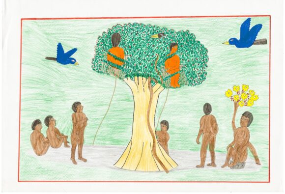
A life among trees does things to the eye. Perspective is not much help in reading a treescape, while pattern recognition is vital. Work here by Kalepi, Joseca and Ehuana Yaira, Yanomami artists from the Amazon rainforest, explores the architectonic quality of trees, expressing them as entire bodies rather than (as the western eye prefers) complex assortments of twigs and leaves. The Paraguayan artists of the Gran Chaco region included here, meanwhile, express their forest home more through typology than through aesthetics. Theirs is a forest as well-stocked and well-ordered as a supermarket. Count all the little animals and plants laid out in rows: this is not a wilderness but a tally of self-renewing plenty. The general lesson seems to be that a forest is an environment that’s easier to read for what it contains than to swallow in one gulp.
Drawings and diagrams by contemporary botanist Francis Hallé honour natural history, a European tradition in which aesthetic knowledge and scientific knowledge run parallel. Twentieth-century laboratory-based science finds its way on to Fabrice Hyber’s huge canvases — like wall-sized notebook pages annotated with multicoloured scribbles, graphs, colour wheels and wave forms. In each, Hyber reduces the trees to a single trunk, or a trunk and a branch: a world of abstractions and generalisations. Cesare Leonardi’s meticulous drawings reveal the architectural potential of trees — a potential mischievously misappropriated in Peruvian photographer Sebastian Mejía’s pictures of trees strained through fence wire, incorporated into walls or otherwise appropriated by the unliving city.
Some works here protest against the world’s breakneck deforestation. Thijs Biersteker, in collaboration with botanist Stefano Mancuso, offers a salve, wiring two trees in the Fondation’s extensive garden to scientific visualisations to help us empathise with what trees are sensing in real time. (This is more than a rhetorical flourish: the sense data that the piece collects are being corroborated and fed into scientific research, in a work that fulfils a dual artistic and scientific function.)
The lion’s share of the show is given over to Brazilian artist Luiz Zerbini, whose muted, simple monotypes and huge, complex, colourful canvases surround a table herbarium and a tree. The paintings are an Anthropocene jungle of sorts in which urban and natural forms hide in plain sight within a fiercely perpectiveless, rectilinear grid. Give your eyes time to adjust, and you find yourself in a city/forest of the future, where nature is exploited but not exhausted, and beauty and utility coexist.
These canvases suggest that we humans, having crafted our way out of the trees and developed those crafts on an industrial scale, can perhaps learn an even neater trick and make the whole human adventure last beyond this current, rapine moment
I came out of this show happy. I wasn’t just enthused. I’d been converted.
Art that hides in plain sight
Visiting Takis’s survey show at Tate Modern for the Spectator, 13 July 2019
Steel flowers bend in a ‘breeze’ generated by magnetic pendulums. This is the first thing you see as you enter Tate Modern’s survey show. And ‘Magnetic Fields’ (1969) is pretty enough: the work of this self-taught artist, now in his nineties, has rarely been so gentle, or so intuitive.
But there’s a problem. ‘I would like to render [electromagnetism] visible so as to communicate its existence and make its importance known,’ Takis has written. But magnetism hides in plain sight. A certain amount of interference is necessary before it will reveal itself.
Does the interference matter? Does the fact that gallery assistants have to activate this work every ten minutes spoil the ‘cosmicness’ of Takis’s art? The sculptor Alberto Giacometti thought so: ‘One day, during one of my exhibitions, he told me that he didn’t agree with my use of electricity for some of my works,’ Takis recalled in an interview in 1990. ‘He disliked the fact that if you switched off the power, the work would cease to function.’
Why Takis’s pieces should prompt such a finicky response isn’t immediately obvious. What do we expect of this stuff? Perpetual motion? One moment we wonder at the invisible force that can suspend delicate metal cones fractions of an inch above the surface of a canvas. The next moment, we’re peering where we shouldn’t, trying to figure out the circuitry that keeps a sphere swinging over a steel wire.
We’re presented with many wonders — objects rendered weightless, or put into permanent vibration. And as the show progresses (it’s surprisingly large, designed to unfold around corners and spring surprises at your back) the work gets less intuitive, and a lot louder. A pendulum, orbiting a strong, floor-mounted magnet, whips eccentrically and not at all gently about its centre of attraction. It’s like nothing in visible nature. There’s no ‘magnetic breeze’ here, no ‘force like gravity’, just the thing, the weirdness itself. Now we’re getting somewhere.
Born Panayiotis Vassilakis in 1925, Takis discovered his alchemical calling early. One memoir recalls how ‘as a small boy, he would bury pieces of broken glass and other such oddments in the ground to see what happened to them when he impatiently dug them out a couple of days later’. In 1954 he moved to Paris, where he fell in with Marcel Duchamp and Yves Tanguy. In London he inspired a group of young artists who went on to create the politically radical Signals London gallery. In America the beats admired him, the Massachusetts Institute of Technology gave him a fellowship, and the composer John Cage encouraged his shamanism. (‘I cannot think of my work as entirely my work,’ Takis writes. ‘In a sense, I’m only a transmitter.’)
Takis treads the same awkward line in visual art that Cage did in music. Cage promised us that behind the music of signs lay some sort of sonic essence. But his snark hunt proved rather dull. Takis’s own search ends more happily, if only because the eye, in its search for signs, doesn’t admit defeat nearly as quickly as the ear. Takis’s traffic signals, stripped of context and perched on tall poles, become eyes full of sadness and yearning. They still mean something. They’re still signs of something.
Made from oddments plucked from boxes of army and air-force surplus on Tottenham Court Road, some of Takis’s more engineered work has dated. We look at it as a sort of industrial archaeology. Its radicalism, its status as ‘anti-technology’, is hard to fathom.
But the simpler pieces need no translation. They are (suitably enough, for an artist whose works often screech and rattle) a sort of visual equivalent of music. They do not mean anything. They are meaning. They reflect harmonious relationships between energy and space and mass. Takis’s work is like his subject: it hides in plain sight.
A clown, a fool, a “klimatosser”
I went round to Olafur’s house for New Scientist, 13 July 2019
SIXTEEN years ago, Danish-Icelandic artist Olafur Eliasson caught London off guard with a massive indoor artwork. Some 2 million people visited The Weather Project at the Tate Modern gallery to bask in the glow of a giant, artificial sun. It was a rare moment of collective awe – created using the simplest of materials. This week, Eliasson is back with a major retrospective exhibition and most of the pieces are new to the UK. But a lot has changed since 2003. Days before his new show opens, we asked the artist about selfie culture, what accessible art looks like in the teched-up Anthropocene, and the hefty carbon footprint that pictures and installations leave behind.
Do big art and big science have to justify themselves to people who don’t get the point?
Sadly, yes, and it’s an argument we’re losing because great science and great art are very much long-term projects, views given to politicians with short-term goals. Making a work might take 10 years. Getting it shown might take another 10. For people to finally settle down with the experience might take 10 years, too. It’s a very slow piece of communication.
You command big budgets. Is the relationship with money tricky for artists?
To make big projects is expensive. But think about how much money an alcohol company throws into the promotion of some new drink! I believe there are studies showing that if you throw a euro or a pound into the culture sector, it generates two to three times as much income. There are more people working in the culture sector than there are in the car industry. It’s also a part of our democratic stability. It’s a space where we feel we can have difficult conversations. Is that expensive? No. It’s actually very cheap.
What can we expect from the show at Tate Modern?
We have about 42 works, big and small. Some are entertaining, like Your Uncertain Shadow and Your Blind Passenger, where a tunnel full of smoke gives you the experience of being blind. Of course, instantly your ears get more active, you touch the wall and stretch out your hand so as not to bump into somebody. Other works are more contemplative.
Wasn’t there a plan to stage something outside the gallery?
Yes. We’re installing three waterfalls. We know today there are no real waterfalls left because they’re all human-influenced, if not human-made. So our waterfalls are as real as anything in nature – or as unreal.
Do you consider yourself an environmental artist?
In the show, there is a series of 40 photos of glacial tongues from Iceland, taken in 1998. I believed then that culture and nature were two distinct spaces. I didn’t fully understand that the Anthropocene age had started. When people look at the photos now, they say “this is about climate”. When I took them, it was about their beauty. Soon, I’ll be retaking those photos from the same angles, in the same places. Maybe in October, if I’ve finished, we will sneak in the new pictures so we have the two series hanging next to each other, 20 years apart.
In December, you brought 30 polar ice blocks from Greenland to London and let them melt. Why?
Some 235,000 people were estimated to have been not just walking by, but at the ice – sometimes physically hugging it – and this, I think, made Ice Watch a clear and robust statement. This is what the data from the scientists looks like. This is what a block of ice 15,000 years old looks like. And it’s going to be gone in a week.
How big is the carbon footprint of your work?
We worked with a consultancy called Julie’s Bicycle, which helps people in the culture sector calculate their climate footprint. The London project came to the equivalent of 52 return flights from London to Ilulissat in Greenland. For almost two years, we’ve been trying to come up with a step-by-step solution for my Berlin studio. And whenever I work with museums and logistics teams, I ask them to come up with a response to the climate.
Our readers care about green footprints, but does everyone?
I was with teenage children in Ethiopia in January. They knew all about global warming, they understood about greenhouse gases and how it wasn’t really them, their parents or their ecology that created this problem. There is no place left where people don’t know this. There are deniers in places like the White House who deny things because they’re following other economic or power priorities.
What can artists bring to the climate debate?
Recently, a far right Danish politician lost a huge number of voters and one of the most prominent members of that party said, well, it’s all these climate fools. And immediately, across the political spectrum, people picked up on it, saying “I’m a clown, a fool, a klimatosser“. If we’re going to re-engineer the systems of tomorrow, we need to risk being foolish. Previous models of success can’t be applied. The planet simply can’t host them any longer. We need to take risks.
How has social media affected your work?
It’s kind of the stone age, the way people walk through exhibitions. People walk up to a piece of art that’s very tangible, highly emotional, with sounds and smells and all sorts of things – and they just bloody look at their phone! The problem isn’t necessarily the audience, but the way institutions over-explain everything, as though without a long text people just won’t get it. And once we are used to that, that’s how we react: “My God, there was no text! I had to find out everything myself!” I say, yes, art and culture are hard work, not consumerism. You have to give something to get something.
Does activism consume much of your working life?
I’m lucky that art can be seen to be flirting with activism, and maybe there is a fertilising relationship there. But that’s one of the good things about getting older: you know there are things that you aren’t good at. I’m very content just being an artist.
But you run a business to drive social change.
I have a social entrepreneurship project called Little Sun, which makes a small, handheld, portable solar lantern. On one side, it has a photovoltaic panel, on the other an LED. It replaces the kerosene or petroleum lantern that you would have used previously. Obviously, sitting with an open-wick petroleum lantern is both very unhealthy and very bad for the climate. It’s also expensive.
Is the Little Sun a success?
We’ve done studies on the impact of the lamp. Say a family eats dinner, then the girl does the dishes while the boy does his homework. Once the girl is done, she sits down only to find there’s not enough petroleum left for her homework. One study showed that the Little Sun increased the boy’s homework efficiency by 20 per cent, but increased the girl’s efficiency by 80 per cent. So the Little Sun project is incredibly inspiring.
“And it will no longer be necessary to ransack the earth…”
Visiting Raw Materials: Plastics at the Nunnery Gallery, Bow Arts, for the Spectator, 1 June 2019
Plastics — even venerable, historically eloquent plastics — hardly draw the eye. As this show’s insightful accompanying publication (a snip at £3) would have it, ‘Plastics have no intrinsic form or texture, thus they are not materials that can be true to themselves.’ They exist within inverted commas. They can be shell-like, horn-like, stony, metallic — they do not really exist on their own behalf.
Mind you, the first vitrine in Raw Materials: Plastics at the Nunnery Gallery in east London contains an object of rare beauty: a small, mottled, crazed, discoloured sphere that looks for all the world like the planet Venus, reduced to handy scale.
It’s a billiard ball, made of the first plastic: cellulose nitrate. Its manufacture had been keenly anticipated. In the US, a $10,000 prize had been offered for anything that could replace ivory in the manufacture of billiard balls (and no wonder: a single tusk yields only three balls).
Under various brand names (Celluloid, Parkesine, Xylonite), and in spite of its tendency to catch fire (colliding snooker balls would occasionally explode), cellulose nitrate saved the elephant. And not just the elephant: plastics pioneer John Wesley Hyatt reckoned that ‘Celluloid [has] given the elephant, the tortoise, and the coral insect a respite in their native haunts; and it will no longer be necessary to ransack the earth in pursuit of substances which are constantly growing scarcer.’
The whole point of plastic is that it has no characteristics of its own, only properties engineered for specific uses. Cheaper than jade. Less brittle than bone. It’s the natural material of the future, always more becoming than being. Hence the names: Xylonite. Bexoid. Halex. Lactoid.
Unable to nail the material in words, one writes instead about its history, sociology, industrial archaeology or ecological impact. On remote islands in the Pacific, thousands of albatross chicks are starving because the parents mistake floating plastic debris for food. Stories like this conjure up a vision of vast islands of discarded plastic coagulating in the Pacific Ocean, but there aren’t any. Instead, plastics eventually fragment into ever smaller pieces that are ingested by marine animals and carried to the sea bottom. In the Mariana Trench, all crustaceans tested had plastics in their guts. So plastics rise and fall through the food chain, creating havoc as they go — a bitter irony for a material that saved the elephant and the turtle, made fresh food conveyable and modern medicine possible, and all for less than 15 per cent of global oil consumption.
What can be gained from looking at the stuff itself? Raw Materials: Plastics transcends the limitations of its material by means of a good story. The first plastics were made in the Lea Valley, not from crude oil, but from plant materials, in a risky, artisanal fashion that bore, for a while, the hallmarks of older crafts including baking, woodcutting and metalwork. Fast-forward 140 years or so and, under the umbrella term ‘bioplastics’, plant-based and biodegradable synthetic products promise to turn the wheel of development full circle, returning plastics to their organic roots. (Designer Peter Marigold’s FORMCard plastic, used here in an excellent school art project, is a starch-based bioplastic made from potato skins.) Then, perhaps, we can break the bind in which we currently find ourselves: the one in which we’re poisoning the planet with plastic in our efforts not to further despoil it.
This is the third and for my money the most ambitious of the gallery’s ongoing series of small, thoughtful exhibitions about the materials, processes and industries that have shaped London’s Lea Valley. (Raw Materials: Wood ran in 2017; Raw Materials: Textiles last year.) The show is more chronicle than catalogue, but the art, scant as it is, punches above its weight.
I was struck, in particular, by France Scott’s ‘PHX [X is for Xylonite]’, a 13-minute collage of photogrammetry, laser scanning and 16mm film. It ought, by all logic, to be a complete mess and I still haven’t been able to work out why it’s so compelling. Is it because digital artefacts, like their plastic forebears, are themselves prisoners of contingency, aping the forms of others while stubbornly refusing to acquire forms of their own?